


In Medias Res
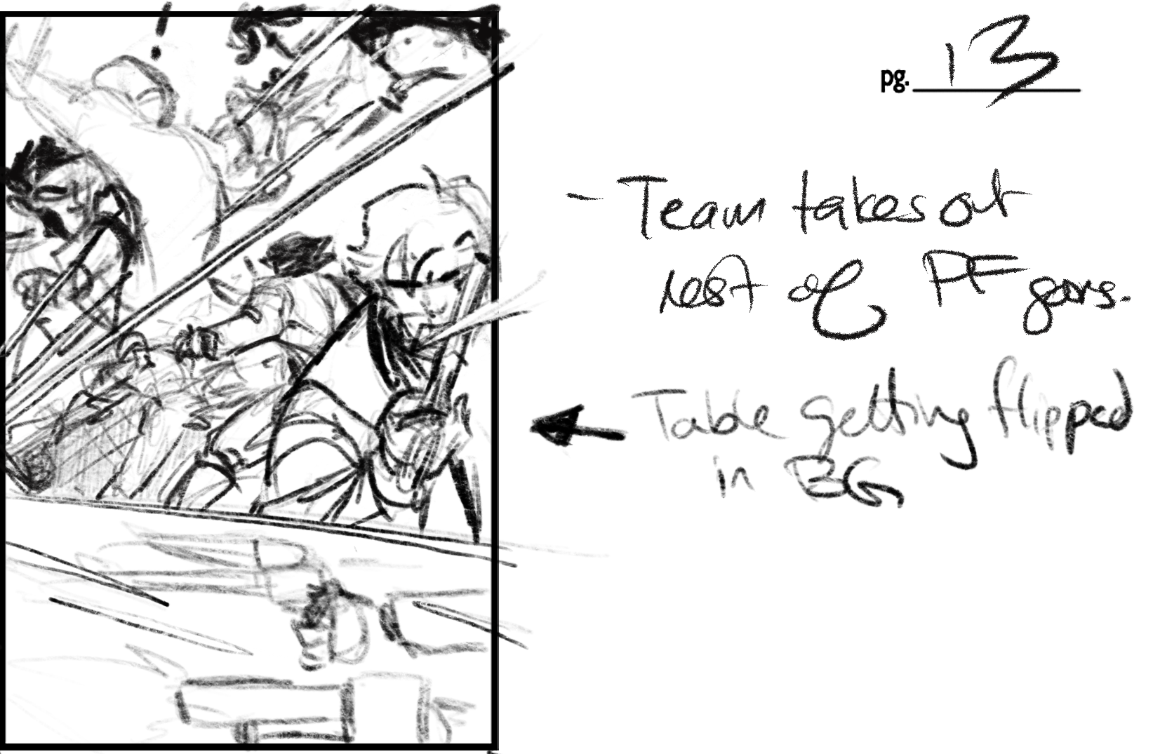
The abstracted coloring of fight scenes is one of the techniques I created for Long John––now that I am at the comic’s end––that I’m most proud of. Originally, it was something created out of necessity and, perhaps, a little laziness (or, to be more accurate, fear), but the thematic impact it had for me was so immediate and (again, to me) the language of it was so clear that I knew I would use it for every fight scene that came after.
What I’m referring to is the fact that I don’t fully render––in colors or shading––figures during a fight scene. I usually assign characters the standard beige or gray and use erasers to cut color out, giving a very stark and simple look to the scene. In this page, though, it picks up a new role of acting as a runway over which we can follow the “golden gun,” so to speak.
I’m not the most creative visual thinker (at least when I compare myself against my peers who are always doing incredibly daring and unique layouts and designs for their comics), but this is one of the things I can point to and really feel an ownership and pride in what it brought to the storytelling of the comic.
Thumbnail for this page. Click for larger version.
Discussion ¬