


Setting the Table
Even though, generally, this is a pretty straight-forward page in terms of blocking, perspective, and acting––the kind of page I love to draw, actually––I actually dreaded drawing this page. To really sell the literal impact of the character colliding into the table in panel 2, I knew I was going to have to draw food flying everywhere, and I am not an artist who has a lot of patience for detail.
Part of this is the historical aspect of it, scouring through my books and internet searches looking for answers of what a luxurious breakfast looked like in America in the 1870s-1880s. I wasn’t necessarily looking for photo references, I just wanted to know what would likely be on the table.
Another aspect is, of course, drawing all the different pieces of food, silverware, and dishes flying everywhere. It’s about filling the page with a lot of stuff that won’t, with hope, obscure the main action the panel is framing. That’s when I realized something that was game-changing (albeit obvious): filling up the page with flying food, means I can obscure a lot of other stuff that I now won’t have to draw! Once I switched my mind into that setting, it was off to the races.
Then came the coloring and I, once again, thought, “What have I done?” So many individual bits and bobs––what should be beige? What should be gray? What should be brown? All of a sudden I had to codify all this food when it was just decoration before. The solution came down to remembering the color theory I created back when I started Long John––colors don’t have to be representative, they can be expressive. It was a fun check-in with the overall process because the question that made it much easier became “What would serve the panel and page the best?”
These foundational check-ins became really important to me over the course of the entire run and helped maintain a consistency throughout even as my style grew and changed over the last eleven years.
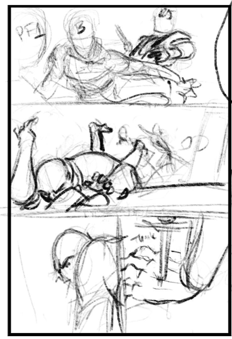
The thumbnail layout for this page. Click for larger version.
Discussion ¬