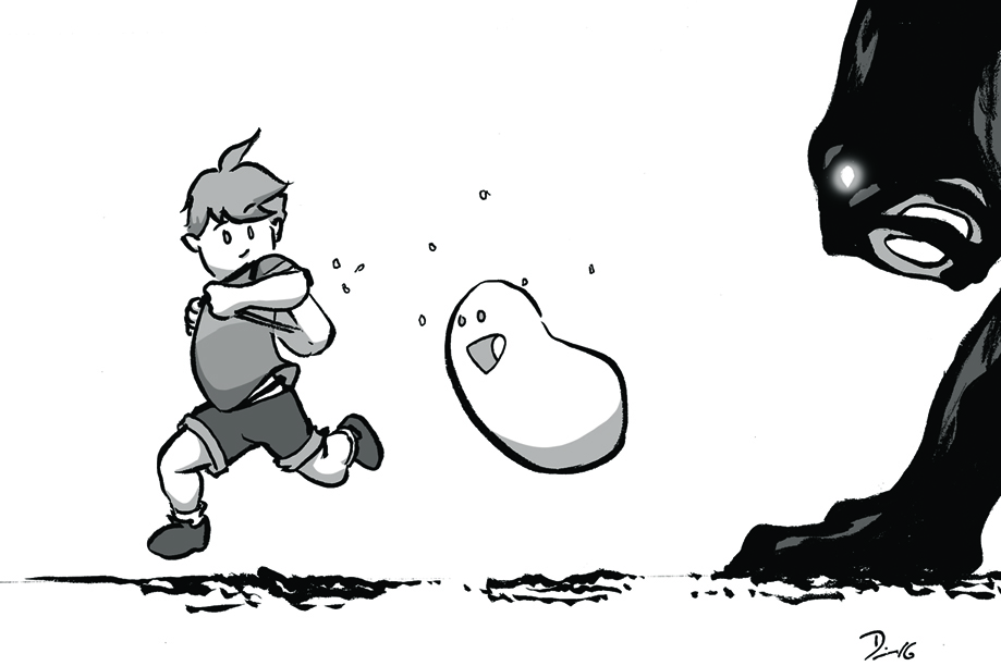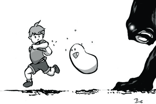
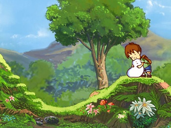
Sketch Fridays #15: A Boy and his Blob. Click to enlarge.
I’m a failed animator. I gave it my best shot, but my education happened at the time when the 2D to 3D changeover was happening and I failed to adapt. More than that, I draw slowly (as you readers know), which is not a good trait for an animator to have. When it came to the animation process, I was much more geared toward the storyboarding end of things, which fed nicely into my hobby of comicking.
Even before I knew about the work that went into animation, I appreciated good animation. As with any medium, “good” doesn’t prescribe any actual information. What I mean by “good” animation is thoughtful animation. What this usually translates to is how good the “acting” comes through in the drawings. I don’t mean voice acting, but the choices the animator makes in the characters’ movements––like an actor bringing life to a character, an animator has to do the same thing for the characters being drawn. Is the character introverted or extroverted? Is the character tired? Excited? What about the character’s past comes through in how the shoulders are held? What does a character do when she’s bored in a crowded room? All of these are choices made by the animator in order to give the character life on the screen, and––in my eyes––how well the animator knows the character the more it will come through in the acting. Making cartoons is more than just syncing mouth movements and drawing walk cycles, it’s making children act like children, the elderly strain under the weight of their years, and extraterrestrials seem relatable.
Though it’s talked about usually with regard to performance nowadays, animation (in the acting sense) is a key part of video games, yet I feel it is still an overlooked aspect of the medium, overall.
Most games are made now in “3D” in that the games are made of polygons rather than drawn sprites and bitmaps with 360 degrees of movement rather than the 2D movement limited to an X-Y axis of something like Super Mario Bros. or The Legend of Zelda. Like cinematic animation, as the technology developed, trends moved away from traditional hand-drawn drawn animation (in films) and the similar sprite-based animation (in video games) to animation generated through a combination of math and artistic talent.
However, a few developers have gone back to the traditional well and show off that even though modern technology can push a lot of polygons, it can also hold a lot of art.
There were a few games when I was young that looked like cartoons. This meant, mostly, that the sprites (the equivalent of a cell of animation; it is 2D and hand drawn, even if completely digital in creation) looked like characters from cartoons. I think of games like the X-Men 1992 arcade game, the Teenage Mutant Ninja Turtles arcade game, or almost any Capcom fighting game. They were thoroughly animated with a lot of thought creating appropriate animations and expressive characters. At the time, despite their technical limitations, it felt like I was playing a cartoon––something animated on a Disney or big-budget anime level. But there was always a disconnect (I am talking about games from the early to mid-1990s) whether it be bad transitions between animations or visual slow-down because the processor was trying hard to keep up or the pixellated sprites themselves––they never looked as slick, smooth, or clean as an animated movie. More than anything, I wanted that gap to be bridged where I could actually play a game that looked as good as a Disney movie, for example.
To that end, the best thing to happen to sprite-based games is high-definition video. Starting with the last generation of consoles (admittedly, it was probably earlier for the PC market), players started seeing sprite-based games that looked less like they were made of LEGO and more like they were painted by an actual brush. Big strides forward happened in independent games like Braid and Dust: An Elysian Tail and big-publisher games like Rayman: Origins and Ducktales: Remastered.
However, it’s the last example that––in terms of animation––stands out above the rest. Ducktales: Remastered remade the classic NES Capcom game, but the studio, WayForward Technologies, added voice acting (with many original voice actors) and redrew all of the art, adding a lot of animation making it look––and, more importantly, feel––like a cartoon. Often I would load the game up and just let it sit and I’d watch the idling animation and actually see Scrooge McDuck breath, and shift his weight, and act like a character rather than just something I control. Despite that wonderful accomplishment, it was beautifully animated sprites over rendered 3D backgrounds which cheapened the overall look.
Before Ducktales, however, WayForward actually created a triumph––the goal I had been searching for since my youth––in another remake of an old NES game. Released originally for the Nintendo Wii in 2009 (and recently released to everything else), the remake of A Boy and His Blob sprints so far into what is an animation masterpiece that I welled up when I booted up the game for the first time.
An actual screenshot from the game.
While there are deeper analyses that could (and should) be done about WayForward’s A Boy and His Blob––about childhood and safety and imagination and friendship––what hit me the most while playing this game was how perfect it looked. This was beyond the Ducktales experience; in every aspect, the game is a perfect amalgam of theme, gameplay, visuals, and narrative. It may not be the best game in the world, but, for the first time in my gaming experience, it really showed the power of animation in the video game context.
In many cases, the animation functions to just keep things moving on-screen so that you don’t realize you’re just moving a game piece across a board. It actually distinguishes a game from a video game, in a sense. For A Boy and His Blob, the animation acts as a narrative gateway, causing the player to not only sympathize and relate to the protagonist but also to ask questions about the story and how to figure out the puzzles in these tightly constructed levels. When the jump is too high, the boy starts to spin in the air––a clue as much as a cute addition to the visuals (for example). The animation causes the player to look around and take in the world which, for this game, is unified and cohesive; a marvelous feat. More than a lot of animated features that I’ve seen over the last few years, A Boy and His Blob really awakened an awe in me, making me wonder how they did it and––more importantly––how soon until they do it again? In short, it is a video game that really awakened the inspiration in me and I couldn’t look away.
And, for no good reason, it has a button that allows the boy to hug the blob. And that makes everything perfect.