
Chapter 6 Cover & Title Reveal
With the new chapter beginning to update on Monday, October 27, it seems like a fair point to reveal not only the title of Chapter 6, but also the cover for the upcoming book.
Admittedly, I have been very lucky over the last few books when the ideas for the covers for “Making Smoke” (volume 3), “Dead Words” (volume 4), and “Parting Gift” (volume 5) came to me rather quickly and early (or, at least, naturally) in the process.
The cover for “Sunza” was a last-minute swing to scrounge together a cover for a book that needed one. I discussed the ramshackle process for that cover earlier, but I can’t emphasize enough that it was not a thoughtful process. The cover for “Bird’s Eye” was also a kind of “time has run out” kind of thing and sketched out that idea in a moment of panicked inspiration.
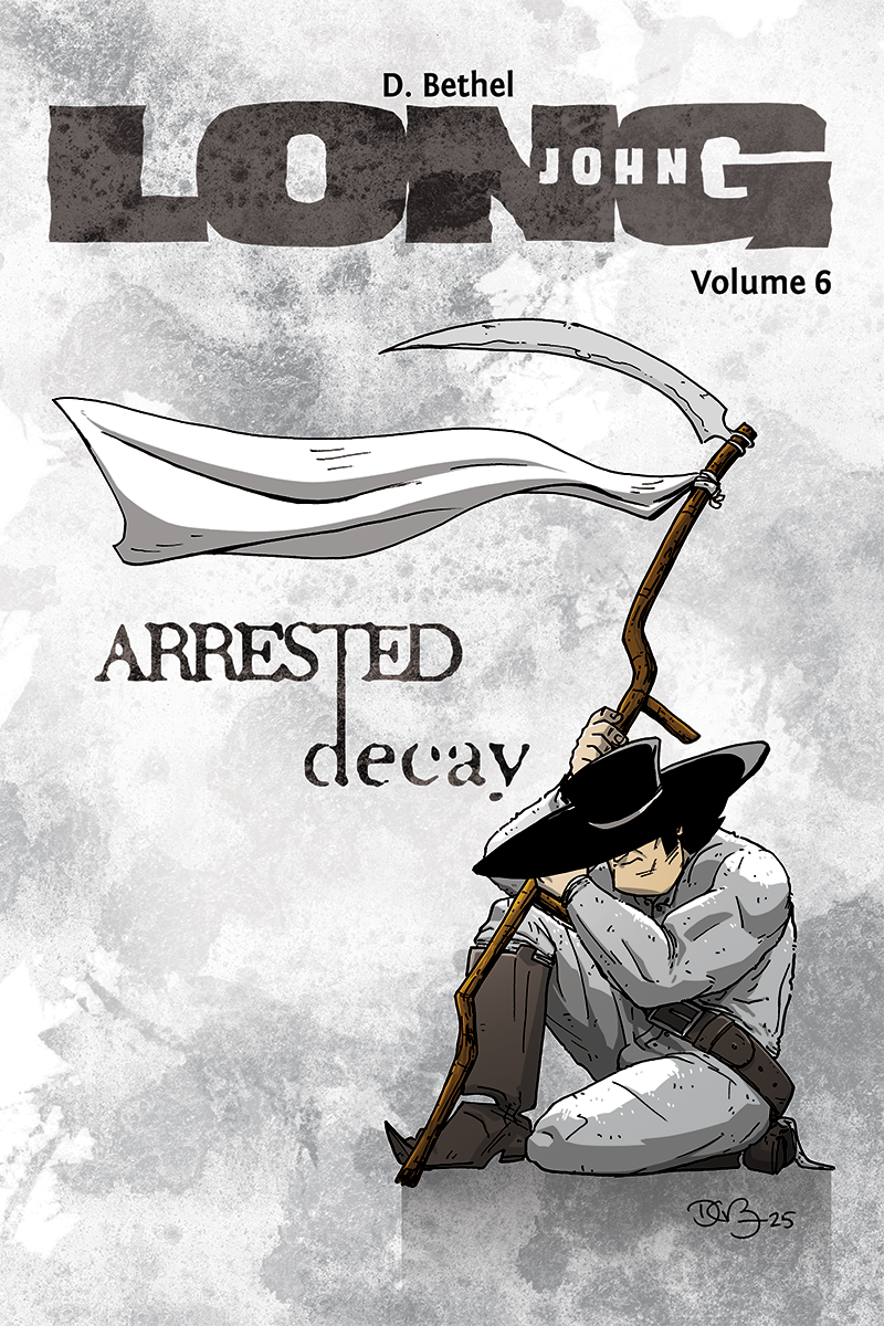
The cover for the final Long John book is a mixture between the two extremes.
As of this writing, this cover didn’t exist at all three days ago. Part of the delay was surely the enormity of the occasion––the last book should have an incredible cover, right? However, I wanted to keep it of a theme with the design of previous books: simple, austere, interpretive. But I also wanted it to be celebratory and epic. So, I vacillated between ideas of simple graphical designs to a more “movie poster” style idea; however, nothing actually manifested in my sketchbook.
So, during an in-class writing activity my students were doing for a large portion of the class on Monday, I had my sketchbook and just drew shapes, quickly landing the image of the scythe with the banner tied to it and, after a few different ideas, Long John posed in the manner he is in the final image.
It was all really sketchy and I wasn’t sure if it would work, though. So, that night I took my iPad up to bed and decided to work it out. An hour later I had the cover image pencilled. I printed the pencils the next morning and had it inked before going to work. By the end of Tuesday night, it was colored and titled.
There was also a very light pattern I was low-key adhering to throughout the designs that I’ve never talked about before. I really view Long John as two halves, with “book 1” being Chapters 1-3 and “book 2” being 4-6; distinct arcs in their own regard. To that end, the color scheme of the colors of each book for each arc were designed around similar color schemes: Volume 1 & Volume 4 are red-coded, Volume 2 & Volume 5 are blue-coded. So, part of what stalled the design of Volume 6 was the unspoken desire to have it be orange/brown coded like the cover of Volume 3 was. But the drawing didn’t call for that, so I decided to break the pattern and I’m happy I did.
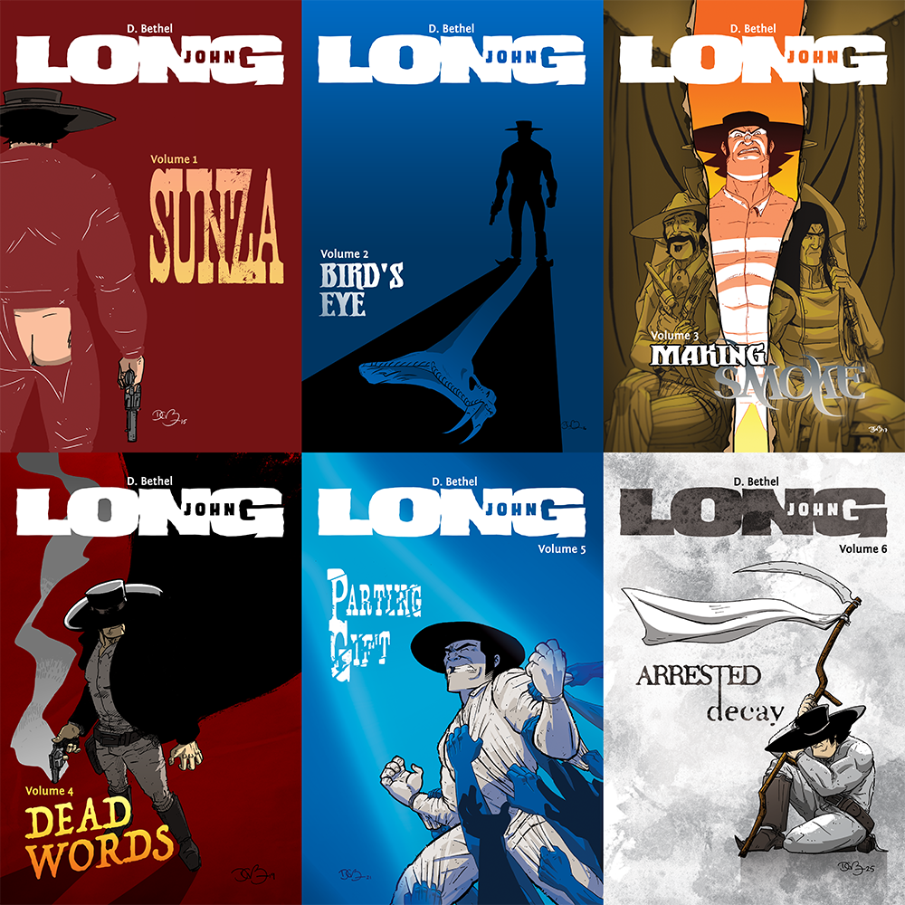
Looking at the gathered covers throughout the series, despite how seat-of-the-pants some covers were and how inspired others were, I’m really happy with the cover work I’ve done for Long John and, to me, are major parts of the tone and voice of the series overall.
As for the imagery, its meaning, and relevance, that’s for you to find out when Chapter 6 starts updating on Monday, October 27. Three pages will go up a week here on the website (with informative blog posts attached to each), but will also be posted to the Long John Facebook page, my Instagram profile (and its associated Threads account), and Bluesky.
Discussion ¬