Amid the Aspens
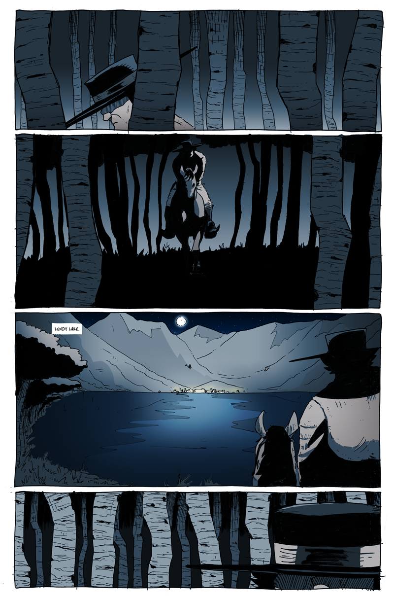
This concludes the first update of “Bird’s Eye” and, as I said in the previous page, it is surely a quick read. Silent pages are like that.
If you’re wondering what Long John is doing here, he did mention in the previous chapter that his contact was located in a town called Lundy.
The color scheme for, at least, the first part of this chapter is very much influenced by the one I used to color Josh Tobey’s “Save the Bones” pages since they take place at roughly the same time of night. Though “Save the Bones” was a side-story (every time I write that, I think of the Japanese word for “side-story,” gaiden and instinctively want to call “Save the Bones” the “Hellrider Jackie Gaiden,” but I’ll restrain myself), it is very much a part of the continuity of the main story and will intersect at various points.
One thing I took away from “Save the Bones”––which was a weird experience, to write for another artist and then to color his work; things I had never done before––was, in fact, a wider palette of colors to use for the coloring process of Long John. On the surface, Long John is a black & white book. While it certainly could be printed that way, because of the very nature of duotone coloring process I use (beige, black, and grey), if want a printed book to be authentic to the colors on the website, I am forced to print it as a full-color book despite the limited range.
With that in mind, expanding the range of colors ever minutely not only enhanced “Save the Bones” (if I do say so my self) but, to be honest, the last few pages of “Sunza” as well. It’s not like the conceit behind Pleasantville where full color will slowly return to the comic as it progresses. That would be weird. It’s more of a case of using colors outside of the standard three-tone scheme to enhance a specific shot or scene for emotional impact or, a more likely scenario, to improve readability of the artwork.
–––––––––––––––––––––––––––––––
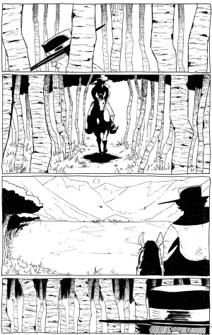
I was particularly proud of the line art for this page (rendering the aspens was fun in a zen kind of way), and is an interesting piece to show how tones and needs can change during the coloring stage. The hardest hit by this page was panel 2, but it was done in the service of drama and I’m quite happy with the final result.


This is a really beautiful page. Really well done.
Thanks, Jason! With a silent page like this, I was really allowed to have fun with the panel compositions. I was a little nervous about the asymmetrical designs of a few of the panels, but, in the end, I was actually quite pleased with them myself. I’m glad you are, too!