


Complete the Set
When asked about the influences on my style, the default answer tends to be animation-based, which hasn’t changed. My slight personal history as an animator surely informed my style, but it really focused in the years leading up to that. Learning about animation and what animation art looked like––very pared down and simple, lacking detail and rendering (i.e., shading)––really changed my thoughts on what a good drawing could be. Specifically, it pulled me away from the hyper-detailed and rendered efforts of American comics at the time (in the ’90s) and pushed me into the realm that focused on movement and acting, such as it is.
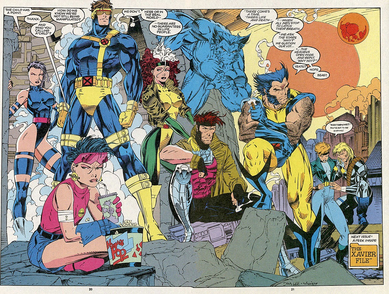
What I thought drawing was supposed to look like for a long while. From X-Men (vol. 2) #11, art by Jim Lee, Scott Williams, and Marie Javins.
But what kept me from achieving in animation was the amount of drawing and the speed at which you must do it. The approximate minimum number of drawings one needs to do for a single second of animation and have it still look good is about ten. Feature film animators draw about twenty-four drawings for each second of film. In the era of HD, that number could go even higher. Because you need between ten and twenty-four drawings for each second of film, you have to draw a lot. Of course, you don’t have to draw one drawing every second, but the faster you can get drawings done, the sooner the animation will be done.
Part of creating so many drawings of a character becomes muscle memory. You learn what the character looks like from every angle, in every situation, in any pose. Because you need to learn all of that in addition to needing to draw so much, that tends to be why animated characters are relatively simple in their design. The fewer lines and/or details you need to draw, the faster it will be to draw. That’s why Mickey Mouse’s ears are always facing you, no matter the direction Mickey Mouse is pointing. Simplification.
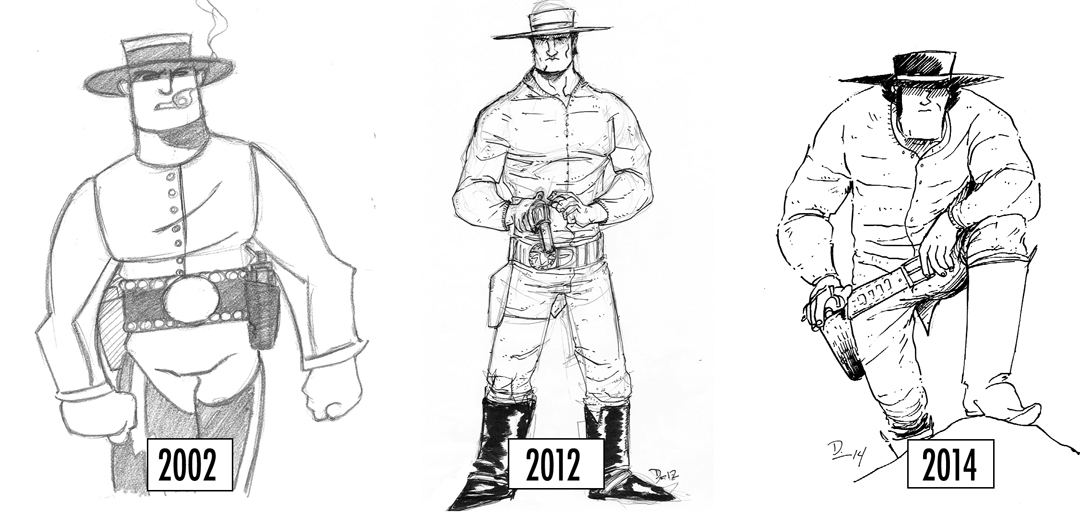
The development of Long John up to the point the comic launched. (Click for larger version.)
Animation usually utilizes multiple artists, as well, handing scenes off between them and sewing them all together in the editing. Because of that, the studio needs to make sure everybody is drawing the character in the same way so that styles don’t change wildly from scene to scene. To do that, the lead designers or animators create model sheets that show the character from every angle, different expressions for different emotions, their height in relation to other characters, etc. Creating these sheets helps keep all the animators in sync with each other and the consistency of the animation remains across everyone’s pencils. It’s important to make sure that the animation drawings match the model sheet, and when it does the term is called being “on-model.” As you can guess, when the animator veers from the model sheet, that is called being “off-model.”
A lot of comickers make model sheets for their series. It makes sense, though staying on-model is less important for comics than it is for animation. In fact, part of the fun is––once you’ve read a series or trade paperback collection––to go back to the first page and judge how different the main characters look when compared to the end. It doesn’t look weird, however, because those changes occur slowly over time as the artist not only becomes familiar drawing the characters but finds their own way to––just like animators––make drawing more efficient.
When it comes to being on-model, I’m a five on a ten-point scale. I do my best in the layout stage to make sure proportions are right and height relations are right, but unless it’s crucial for the panel or page, I don’t fret if things are off. Juan John gets pretty off-model on this page (specifically panel 1 and the last panel), but I bet you didn’t really notice––or, if you did, you didn’t care––until I pointed it out just now.
Since Long John is the character I draw the most for this comic, his model has refined and become more consistent over time. I never made an official model sheet for him aside from the character design I shared a few weeks ago. As I said then, that was what I considered (and still do) to be the first “official” drawing of Long John and, going forward with development, that was the design I was using right up to the drawing of the first page.
But Long John’s model has become much more simple since then and, in some ways, more iconic. I don’t mean “iconic” in the “one of the greatest” sense, but in the iconographic sense––it’s a design that’s easy to spot. This basically means the design underwent a distillation into the necessary elements to make the character clear on the page.
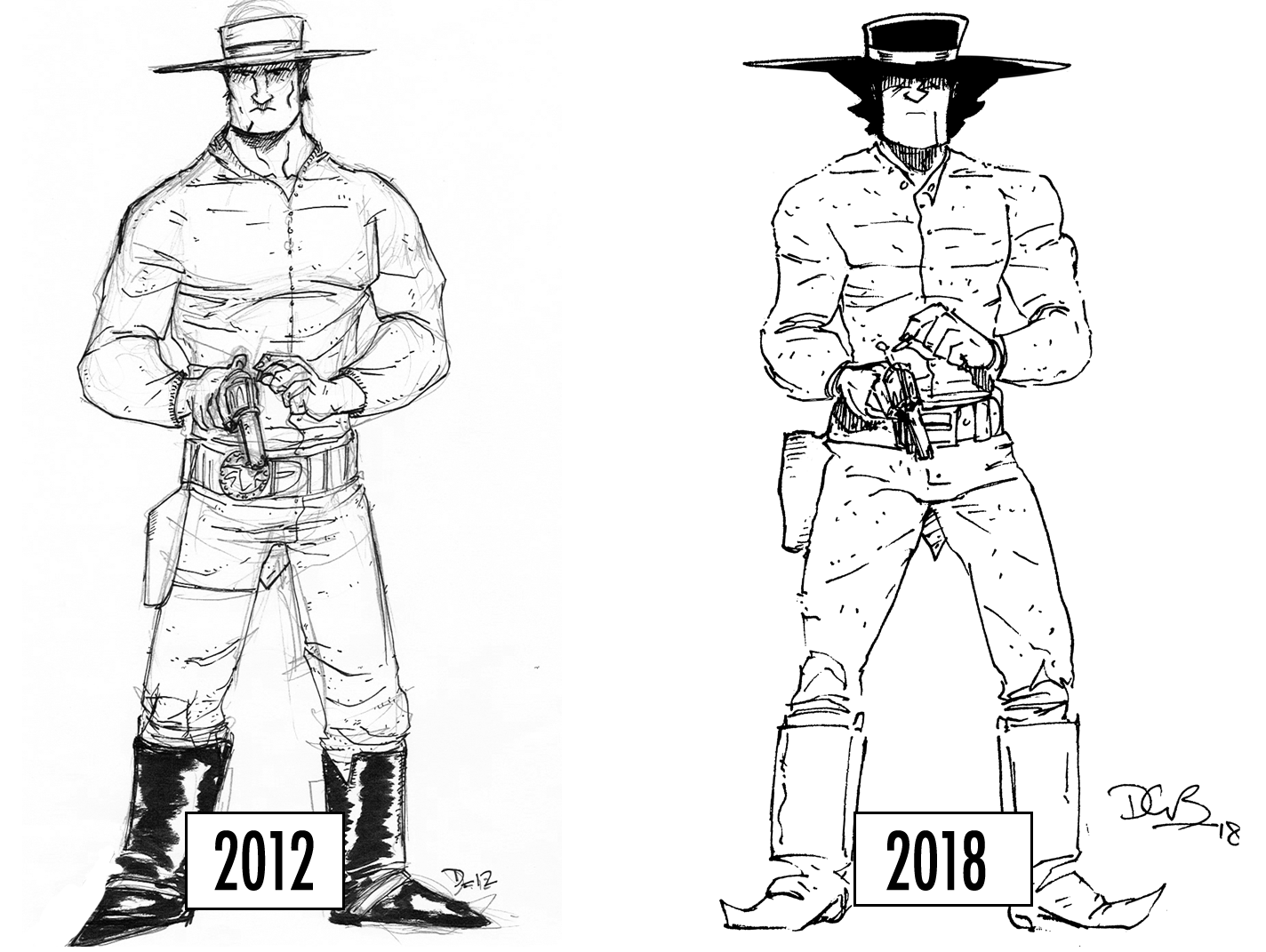
A comparison of the original model with what would be the model if I drew it today (note: this was drawn quickly and hastily so the new model is also, technically, off-model, but the main elements are there). (Click for larger version.)
So, what are those necessary elements? The three saw-blade points of hair on either side of his head. The chin line that cuts up about a quarter of the way from the left or right of his chin. The small, z-shaped broken nose. The pointed toes on the shoes. The bunches and folds around the joints and where the belt and boots meet his long johns. Stuff like that are what I’m looking at when giving the final okay to a page.
It’s a weird thing to think about, and being on-model is not crucial for my psyche. However, there are certain cues I look for to make sure that, at least, the drawings are clear so, no matter where he is on the page, how large or small, you can spot Long John immediately.
Discussion ¬