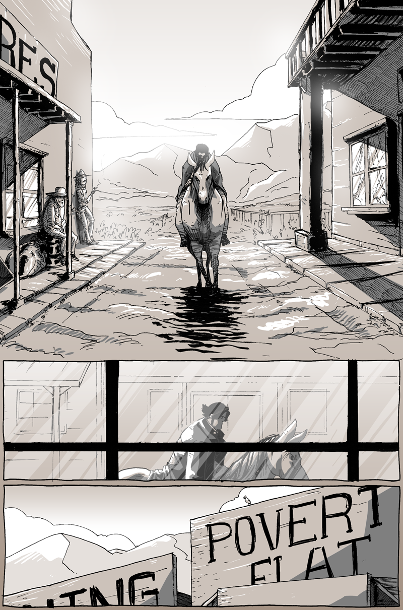
The town he’s wandering into is called Poverty Flat in the comic. In reality, Poverty Flat was the progenitor of what is now Lee Vining, CA. However, the town didn’t officially have that name until the 1950s; so, you know, that wouldn’t work. A few sources confirmed that Lee Vining originated as a podunk mining town without many amenities nor visitor appeal––it was, at its heart, utilitarian. Lee Vining is still a rather small town, and though it has a deep history, it’s not a very widely recorded one, visually. Many of the photographs I could get my hands on were taken after the start of the 20th century and, though they were minutely helpful, weren’t very useful to help create the look of Poverty Flat in 1881.
What I ended up doing was combining a few different buildings from around the area and shoved them together to create the Long John Poverty Flat. As I’ve said before, even though Long John does take place in a real setting and goes to real towns, it is not a dramatization of actual history, it’s a comic about a cowboy with no clothes first. And what I needed on this page was Long John riding down a narrow street, framed by buildings. Other towns that he goes to (well, one in particular) will be a bit more accurate, but mostly because 1) it is very well documented, photographically and 2) it is a bigger city that will have Long John all throughout it and so a bit of planning will be needed.
–––––
I am a picky artist, no doubt. I was excited to layout this page and I was excited to see it done––but I was never excited to draw it. Big, bold, declarative drawings are important in comics, but they are hard to draw. I think I did a fine job, but it was a really big struggle to get this page done, especially during inking.
As is usual, I ink the stuff I like to draw and ink first (i.e., the easy stuff––people, mountains) and slowly started laying down lines on the buildings. I got about halfway through the building on the right (in panel 1) and stopped out of frustration. It wasn’t looking cool enough. It was too bland, like a mechanical drawing and didn’t convey the rickety nature of a hurriedly built, single-use town. I wanted it to look like it was built by amateurs (if not drawn by one) that those people on the left sit there every morning until they’re ready to head out to do whatever it is they do. But with the pens I was using, it wasn’t looking like that.
So, I broke one of my rules.
I have a small “bible” that I created (in my head) for Long John. An obvious rule is the three-color limit. Another big one is that I would primarily ink using Micron Sakura pens. I would ink quickly and let mistakes lie on the page unless they were incredibly disadvantageous to the storytelling––at which point I would do my best to fix those mistakes on the page.
Eben07 was a genuine hybrid experience. I mostly inked on the page, but for complex stuff like buildings or vehicles, etc., I would often do my best on the page, but knew I would probably redraw it on the computer. The lines of that comic were very clean and things like buildings or vehicles, etc., were very mechanical and precise. Because of that, I felt that the lines of the characters looked very separate from the lines of the backgrounds, giving Eben07 a much more “animated” quality. But I wanted Long John to look like a comic. For Long John, I wanted everything to have a shared aesthetic––for all elements to have the same line quality and, therefore, look contiguous––and the easiest way to do that is to draw everything using the same medium and all in one place.
With that in mind, I broke that rule…kind of.
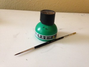
Buried in frustration, and trying to adhere to my rules, I threw caution to the wind and got out my bottle of ink and brush:
As soon as I lay the bristles on the page the background came alive, evoking everything I wanted out of the page. Sure, it wasn’t as I imagined it exactly in my head, but nothing does––in my head, the comic is drawn by Simon Roy, Giannis Milonogiannis, and Moebius all at once––it did, however, surprise me. I guess this is what you would call a “happy accident” that actually was more “me” than what my brain could even conjure.
With the success of this page (and there are certainly flaws, but they’re overshadowed by its cohesiveness), I essentially re-wrote my own rules and the comic is better for it.


Discussion ¬