


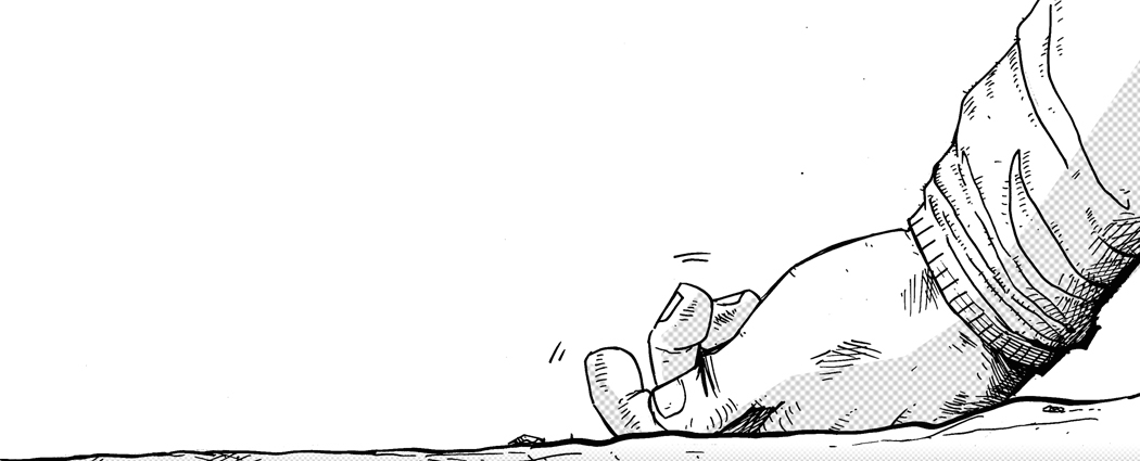
A lot of these first pages are about experimentation. As is clear with the previous page and this one, I went all out when rendering the tufa towers that Long John is propped up against. For the sake of time, you’ll see that attention to environmental detail only pop up when a visual impact is needed. A lot of thought went into the color scheme (or lack of color scheme). The decision to go with gray, beige, and white was actually a personal compromise between simply wanting to do a black and white comic with gray tones as shading or to do a black and white comic with sepia shading. As is also the trend with many comics now, I played with the idea of overlaying textures on the comic and also flirted with screentone shading. However, combining the sepia with the grayscale yielded a result I hadn’t really seen before and still gave me the minimalist impression I was going for.
An example of an early experiment with using screentones. Click for large.
However, working with this “tri-tone” method was a bit confusing because I didn’t want to just have all objects have a flat beige base with gray for shadows and white for highlights. I wanted the colors to be more expressionistic than that, and you’ll see how I play with that in future pages.
This vein of thinking also came around because I realized how limiting only three colors can be when trying to color using the more traditional process I used for Eben07. That wall was hit in the third panel of today’s page where what was supposed to look like a desolate high mountain desert lake landscape ended up looking a little more wet and slick. But that’s the process, trying and moving on!
this book is so tuff