


What Goes Around
This chapter has the most amount of active characters in it so far, though most of those are secondary, nameless characters. To that point, with the the amount of people and interaction that occurs in these pages, one of my worries was––as it always is––clarity. This specific worry comes down to color (seven pages into the chapter before I brought up coloring––someone somewhere won a bet) in that things can easily get lost in a limited color palette. However, the benefit of this is that things can easily get lost in a limited color palette.
This was a worry because how could I assure that readers would be looking at and following the characters that I wanted them to. Also, how can you tell that one character is more important or powerful than another when they’re all the same four colors?
The solution goes back to my general approach to coloring for Long John in general: expressive rather than representative. Since this isn’t a full-color comic, there’s no requirement that every item needs to have its own, constant shade of sepia or gray or whatever. We’re looking at this world through a lens that I made, so I can show you what I want.
This really started with the previous page and the two large crowd panels. I obviously placed the most important character in the middle––using composition to answer that question from earlier––but I realized if I colored everybody with white shirts and gray pants and brown coats or vests––and mixing that up a bit––it would make the page look calico and not really emphasize the fact that the Bishop is a dude with a posse.
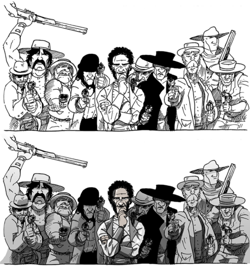
The lineart on top and the final art on the bottom. Notice that the Bishop’s posse is all greyed out to emphasize The Bishop.
So, I went back to the initial fear: everyone will blend together. That is true, but how do I get the character I want to stand out to do just that? As it turns out, the neat trick I learned is that I don’t have to color everyone it. I just made the posse grey. So, even though there’s a lot of characters on screen, there is only one capital-C Character and we know exactly who it is.
I bring that technique again on today’s page, opening up the contrast when someone speaks. That’s why the lackey in the last panel is colored in, because he’s interacting with Long John. I now see characters lighting up like the sidewalk squares in Michael Jackson’s “Billie Jean” video, becoming unique when being used.

How background characters work in Long John.
As promised, below is the inking video I made of the final panel for this page. For me, it’s fun seeing this one come together.
Watching these videos is a strange experience because it’s not like watching a home movie where watching the process (very sped up) walks me down the memories of being there. I don’t remember inking the page. Drawing is not a particularly memorable process; it’s about getting the thing done.
The main takeaway from these are seeing what my habits are––my strengths and weaknesses. These videos provide a genuinely objective look at how I draw and rather than being embarrassing or hard to watch, I become a bit emboldened by it. It’s direct evidence against my self-doubt: “Look! Here is proof that I can do this!” It’s nice to put such things away for awhile.
Discussion ¬