
#FourComics
There has been a fascinating meme going around the internet during the last week called #fourcomics. Started by prolific comic writer, Jim Zub, on Twitter, he asks creators and fans to post the four comics that really inspired them in their youth. With such an interesting premise, I decided to jump on the bandwagon. However, narrowing down the influential comics in my life to a mere four was a bit more trying than initially expected. However, when thinking about which comics were inspiring only as a youth, four comics did, eventually, rise to the fore. Though I can’t necessarily vouch for their current impact or importance, there is no doubt that young comic-reader Dan was pushed into the realm of story-creation and drawing by the four comics below.
X-Men #1 (1991): This was the first comic I ever purchased and was hooked from the get-go. It was, it could be argued, a signal flare that helped to ignite everything that went wrong with comics in the ’90s, but I hold onto it because of its incredible nostalgic value.
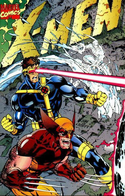
One of five different, interlocking covers released for X-Men #1 in 1991. Art by Jim Lee & Scott Williams.
Aside from being the first comic I ever purchased, it also set an aesthetic standard that took awhile for me to shake. Not that it needed to be shaken, but because of Jim Lee’s (admittedly) astounding art in this issue (well, the first 11 issues of this series), it was basically all I wanted to look at. Jim Lee’s style became the “Marvel style”––if not the industry style––for the entirety of the 1990s, but there was no comparison to the original, no matter how many Lee lookalikes they put on X-Men after he left. It’s because of his style that, while Jim Lee was on the book, I only read X-Men and thought everything else was terrible. When Jim Lee left the X-Men to co-found Image Comics, I dropped all Marvel subscriptions and followed all of Jim Lee’s Image books.
Though the aesthetic eventually wore out on me, I would argue that Jim Lee’s style is still––as much as I may fight it or deny it––what underpins every drawing I make, and it all started with X-Men #1.
X-Men: God Loves, Man Kills (1982): When I first read this X-Men graphic novel (I’m sure, purchased at the local strip-mall bookstore, Waldenbooks), I was blown away by what was an original concept (for me) in superhero comics––it had a profound social message beneath all the action scenes and spandex. A little preachy, but no less impactful, God Loves, Man Kills is not talked about very much even though it was one of the stories used as the basis for the second X-Men film. But to read such a moral superhero story at a young age, I began to wonder why more comics weren’t doing what GL,MK did. It’s been at least a decade since I read it––I don’t think I even have the book anymore––but certain images stick with me through to today that undoubtedly shaped the type of stories I enjoy reading in comics, though so rarely find from the Big Two.
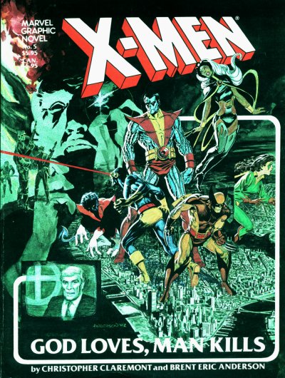
The cover for the oversized edition. Art by Brent Anderson.
This book was added to my library early in my X-Men-reading days, and as much as the story hit hard, it was a nice bridge for me between the X-Men I met in X-Men #1––which kicked off the ’90s X-team takeover––and the “classic” X-Men stories and style that inarguably started in 1975 with the addition of writer Chris Claremont (writer of GL,MK) who helmed the book continuously for 16 years. Despite the fact that it didn’t read like the typical ’90s absurdity I was used to at the time, it did offer clear introductions of the main characters, their superpowers, and how they worked together as a team, something that wasn’t done so well in the ’90s comics, but was a mainstay of the genre’s narrative before.
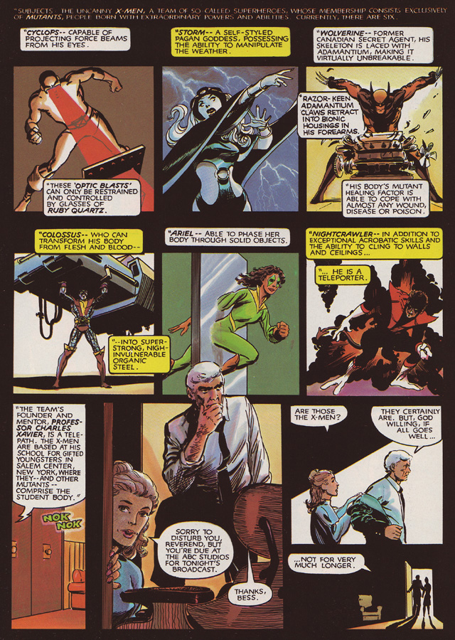
An effective introduction of all the main players.
Also, despite the fact that Brent Anderson’s art didn’t look like Jim Lee’s, his style is undoubtedly cinematic and affective, something that this story needed and, as much as it pains the twelve year-old in me to say this, something I don’t think Jim Lee could really accomplish during his X-Men heyday (though GL,MK was long before Lee arrived on the scene). Anderson’s imagery hit hard and heavy and, even though the comic was full of spandex and laser beams, left a mark that stuck with me upon closing the book, realizing I had read something important. More than any other book on this list, I would hand this to a person who was not a comic reader as evidence that comics work on the same level as any other media.
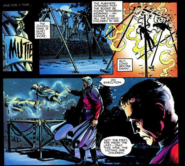
A powerful scene that opens the book.
Darker Image #1 (1993): One of many of Image Comic’s failed experiments, Darker Image #1 is saddled with as much innovation as excess. Containing three short stories with art by Jim Lee (doing an amazing pastiche of what was, at the time, Frank Miller’s de rigeur, high-contrast style closely associated with Sin City), Rob Liefeld (he of “Captain America with Boobs” fame––but he also created Prophet, so he gets a lifetime pass with me), and (Sacramento’s own!) Sam Kieth, I was entranced by the wide variety of styles, stories, and sass. Admittedly, Kieth is the only artist in here doing what he always does (and, as ever, it’s amazing); both Lee and Liefeld are challenging themselves with their art––something that makes this single issue stand out as a strange, beautiful blemish in the otherwise rather stale ’90s Image style.
Again, Lee proves that he is an incredibly capable artist with the story that debuted another of his original creations––a sort of Rambo with superpowers called Deathblow who went on to his own long-running series. Deathblow showed an entire new side of Lee that, I’m sure, most of his fans weren’t expecting and showed young artists that even when you’re on top of the world, you need to keep experimenting, pushing your talents so that when you put pencil to paper, you’re drawing rather than relying on mere muscle-memory.
Sam Kieth premiered (with Image Comics) what became his signature creation in this issue––The Maxx––and lead to a long-running, respected solo series and even had an amazing animated version made by MTV. His style is incredibly unique and remains one of the few artists around whose work I look at and ask, “How did he do that?”
Rob Liefeld really pushes himself here, particularly with the inking. Though the character, Bloodwulf, is a bit of an on-the-nose parody of Lobo and the storytelling is heavy on the meta-humor, I feel as if this is probably the most focused and honest Liefeld project ever to be created. It feels like the kind of stuff he would draw and leave hidden in a drawer for people to find fifty years later after his death. I guess what I’m saying is that Bloodwulf reads––and the character didn’t last long beyond his appearance here, I believe––like a passion project and, because of that, I think it may actually be the best thing Liefeld ever did, which would have been lost, I argue, had it gone to series. Freed from all shackles of personal and social expectation, there are no straight-edges and the inking is loose and progressive for the ’90s, carrying––dare I say––the Moebius-type of inkwork very comfortably.
Darker Image was intended to be a mini-series, but it never got beyond the first issue; in some ways I’m glad because it’s actually a real gem, for all of its indulgences. I read through it again from time to time and still get overcome by that sense of excitement and wonder.
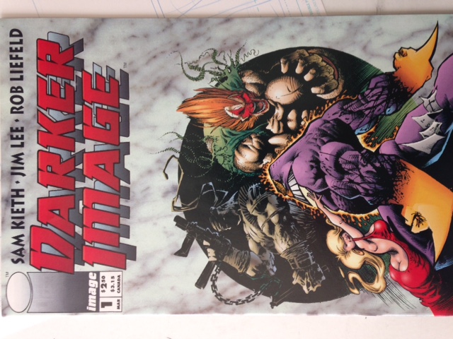
Darker Image #1, art by Sam Kieth.
Blade of the Immortal: Criminal (1996): Dark Horse’s first, double-sized issue of Hiroaki Samura’s amazing Blade of the Immortal fantasy/samurai epic blew me away. Eventually, I began dropping all subscribed titles and, for a few years, this was the only comic I regularly bought. Samura’s art is incredibly grounded and, at times experimental. Much of the art in the series is solely pencil, showing the skill the classically-trained Samura brings to comics. His sense of composition, anatomy, and dynamics impresses while still being clearly manga and following many of those conventions.
However, what made this comic stand out, for me, was how the art changed depending on Samura’s intent for the page. He would bounce between leaving the drawings in pencil (and fully rendered) and a more traditional pen and ink, and––especially upon further readings––the reader can’t help but notice that this was a choice and not a consequence of laziness or, as was sometimes the case, redrawing a panel as a way to ease translation to western audiences (a conceit rarely done by other manga artists).
Though incredibly violent, gory, and unsettling, Samura’s compositional sense, character design, storytelling, and premise really hit me hard, especially as I started to discover the artist I was in late high-school. It’s a hard comic to recommend because of how R-Rated it is, but based on art alone it’s nigh peerless for its creativity and talent.
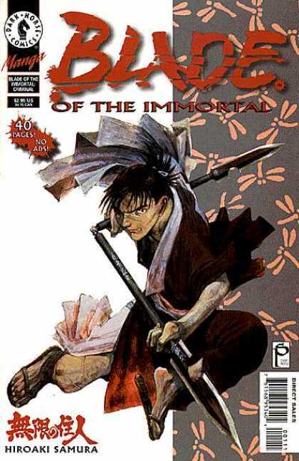
My introduction to manga. Art by Hiroaki Samura.
Again, some of these comics I wouldn’t necessarily consider all that influential on the comicker I am today and the work I’m making. However, as the catalyst for starting that trek, I can’t shun any of these for any reason because even though some have been buried under my artistic house for years, that does mean they are the foundation upon which the house was later built.
Podcast: Play in new window | Download
Discussion (3) ¬