
SKAB
An artist I’ve been following for awhile is Jon Berg, a Canadian comicker who is currently working on his creator-owned comic, SKAB, a post-apocalyptic fantasy adventure. Aside from the gorgeous art in his unique style, what drew my attention is the creative spirit we both share––SKAB is a the result of a singular voice. In other words, he does everything on the book (writing, art, coloring/shading, lettering, and publishing), just as I do with Long John. That alone made me pay closer attention to his craft and his approach to publication.
The first issue of SKAB has been in development for awhile and Berg has been really open with his process on Instagram, sharing pages and panels in progress through every stage of creation, something that regular readers of Long John (or those who follow me on Instagram) know is something that I love to talk about (especially since focusing on process is literally my day job). While most of what I love about it is to see how other people create, the automatic addendum to that is to compare what he does against what I do––not to compete, but to learn.
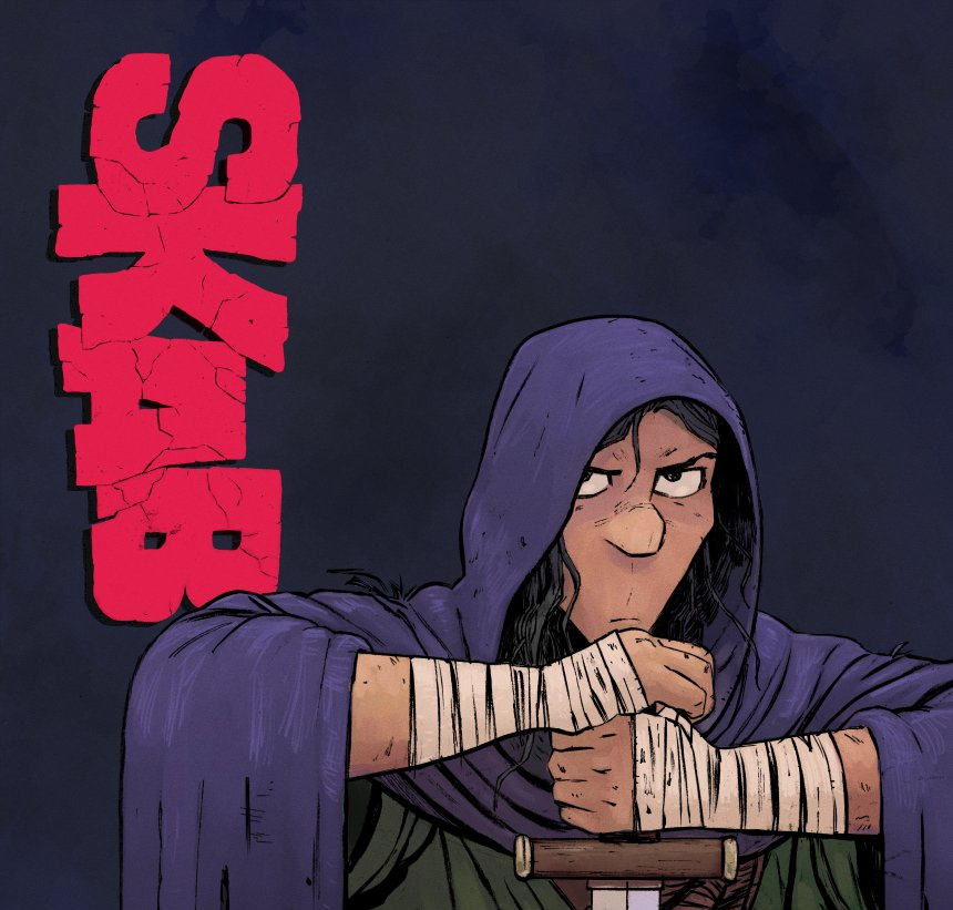
Berg is another artist who draws everything on the page but is more bold with his art in every way. While I rely on non-photo blue pencils for my penciling stage, Jon goes all in with messy, thick graphite pencils. While my primary inking tools are thin-tipped technical pens made by Sakura Pigma Micron, he goes all in on brushes. His linework is bold and tactile and painterly, which carries with it a cohesive, unified quality that is best summarized in this most amazing page (the first slide):
This page captivated me, causing me to scrutinize and study it in a way I actually don’t often do with comics. Mostly, when I’m looking at pages critically it’s a matter of narrative clarity––can I tell what is going on? However, that is not even a question I had to ask seeing that page (and, honestly, every other page in the book). Everything in the page above is about storytelling. From the panel arrangement (page composition) to the drawings of the panels themselves (the panel composition) to the organic, living lines of his brushwork to the incredible acting he’s done with the characters really shows me––in a single page––everything I try to do with my comics. There’s clear narrative, dynamic visuals, effective world-building, and believable character all in six panels and focused, naturalistic dialogue (which you can read on the website––the comic is an active webcomic as well). It’s a masterclass while still being frayed at the edges and imperfect, which honestly makes it perfect.
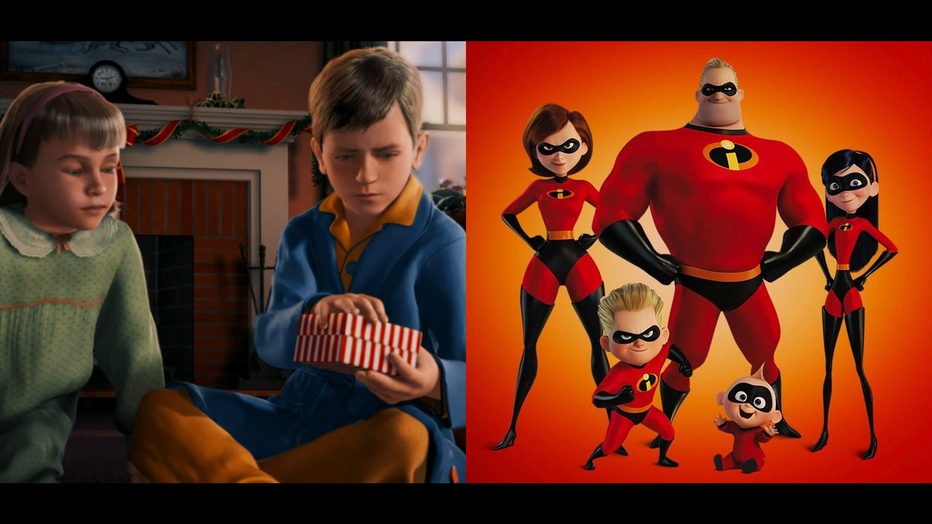
I’ve never been a technical artist by any means, but for years––especially with the art in my first comic, Eben07––I tried to be a clean artist. Part of that was because it made it easier to color, but the truth is that I thought a comic made by me would be “better” if it were closer to being technically “perfect” (despite never being a very technical artist, but the brain is a mysterious creature). That, of course, is not true. This last March, I had the pleasure of once again being a guest speaker in an upper division graphic literature class at the local university (for which, the first two volumes of Long John were part of the reading list, which was awesome), and part of my talk was built around the dissonance between the realistic and the believable. The slide I used to start this part of the discussion was a side-by-side of a shot from The Polar Express animated film and a shot from The Incredibles. While The Incredibles isn’t anywhere close to realistic, even in a single frozen frame those characters are instantly more believable because of the artistic intent, creativity, and consideration put into every aspect of their presentation. We get a sense of who each of these characters is just by looking at them. While the characters in The Polar Express image are more realistic, they look like posed mannequins with no real sense of individuality or life. What I mean by this is that leaning into the technical side of things doesn’t mean it’s going to be a world that people will want to fall into and explore. You have to make it feel alive and that doesn’t necessarily come with perfectly straight lines and having every window drawn in a skyscraper.
When I started making Long John, the ethos I had going into it was to make it “look like a comic” instead of what I had tried for Eben07, which was to make each panel look like a frame of animation. What I am unconsciously aiming for is to make a comic that feels as cohesive and alive as possible––to make the world and characters of Long John as believable as possible. It’s that sense of “believability” that Berg has on full display in this page (while also clearly exhibiting incredible technical and artistic acuity) and it shook me. It’s present on every page in this book, making it one I’ll be scouring and studying for a long while I try and make that even more present in my work.
Berg made it known a few months ago that he was printing the first issue and would be available for purchase shortly. I’m not going to sanitize the truth––I kind of stalked his store page and couldn’t click the purchase button faster when I saw listing. Imagine my surprise when the book arrived with a delightful and unexpected sketch from Jon.
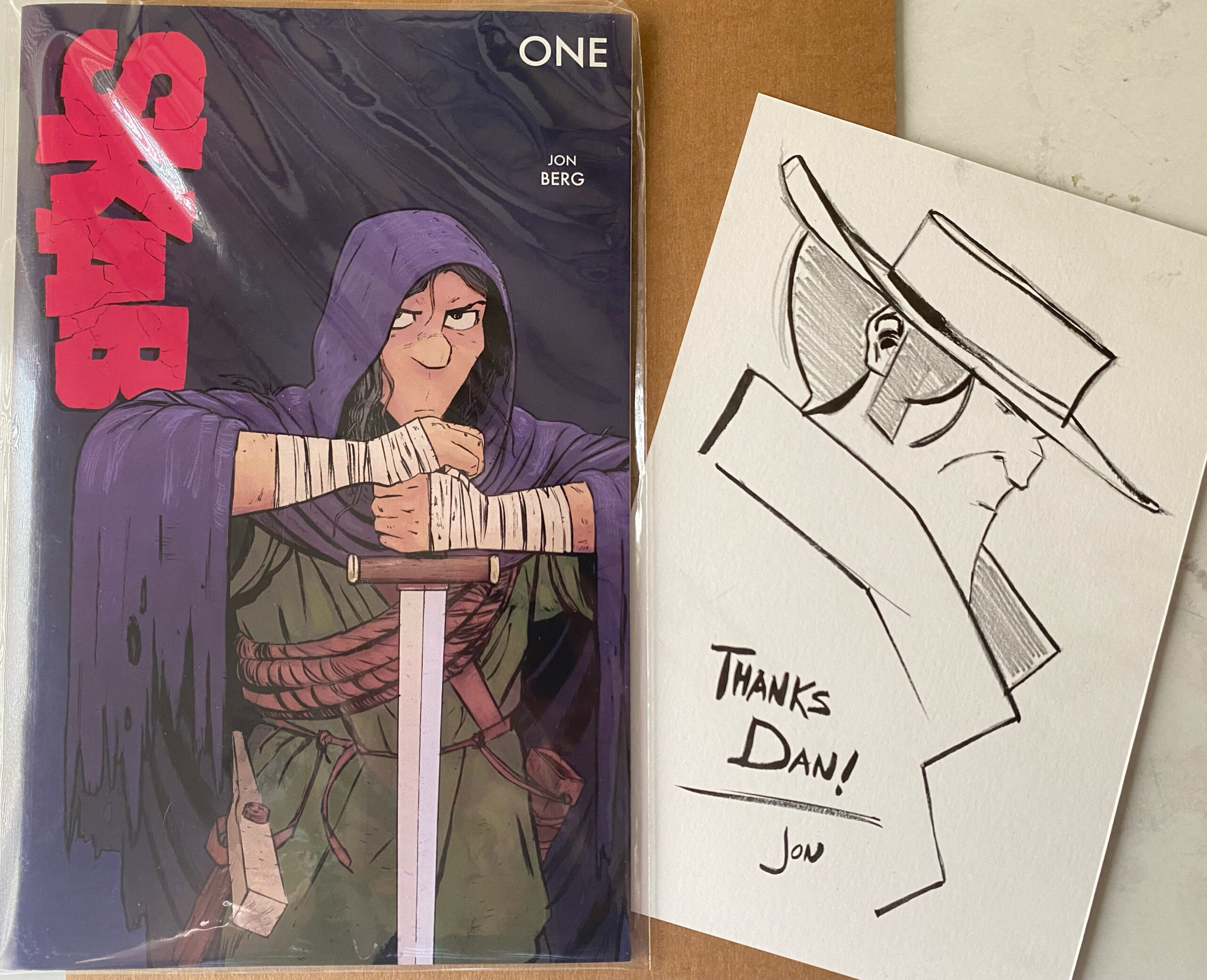
It was a fun, quiet nod of recognition, an acknowledgement of effort and ethos that, with hope, motivates and inspires and challenges each other as we push forward with our worlds and stories and characters that people can believe in.
Discussion ¬