
Sketch Fridays #20 – Liefeldesque
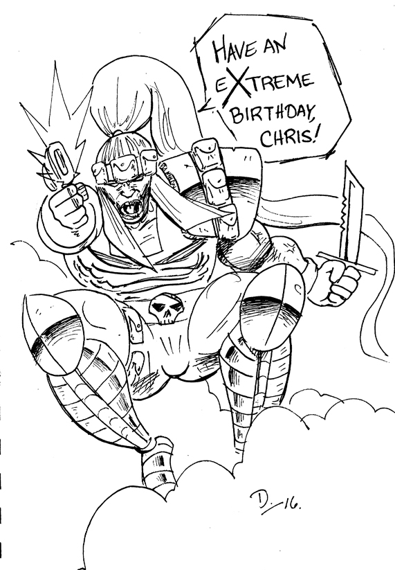
Sketch Fridays #20 – Liefeldesque. Click to enlarge.
My favorite artist in the mainstream comics medium (meaning someone who draws for either Marvel or DC comics) is Greg Capullo, a fellow whose work I’ve followed since the mid-1990s when he started drawing the Marvel title, X-Force, shortly after series creator, Rob Liefeld, left. With his tenure he brought what can best be described as a weight to the characters––a roundness and believability that contrasted well with the bulked-up, heavy characters that Liefeld and his progeny always drew with a feathery loft. Despite all the hardware his characters wielded, nor the amount of veins that protruded from the arms, legs, necks, and faces of the characters, Liefeld’s kinetic style meant that his characters were almost never touching the ground. They were always mid-run or flying from the follow-through of a missed (or connected) punch. Liefeld drawings always look like beach balls in a racquetball court, which––in hindsight––focused the attention on him from the house style of the late 1970s. Things were moving his direction anyway, with the likes of Neal Adams, John Byrne, and Todd McFarlane, but Liefeld kicked the door in and invited all of his friends.
However, Greg Capullo brought––and pardon the pun––gravitas to Liefeld’s characters. Cable felt heavy and worn and tired. Cannonball actually felt explosive as he didn’t soar but blasted through the air. Capullo took over right before a major X-book crossover happened, my first crossover event called X-Cutioner’s Song (sigh), where Cable’s fuzzy origins come home to roost (and kill people). I remember being shocked by how different Capullo’s art was; it felt rounded and believable despite being very cartoony and stylized. When he left X-Force for Spawn at Image Comics, I started subscribing to that title in response.
Capullo is currently bringing his excessively popular run on the “New 52” Batman title to a close, drawing nigh fifty-one issues (he took a few issues off here and there), but he continues to prove that he’s a work horse that is not only competent but versatile and capable.
In an interview Capullo did in the last few years, he talked about one of the major hurdles he has had to overcome to become as good and versatile and capable as he is. He referenced, as evidence, a rejection he got from an editor at Marvel Comics early in his career. This editor said that Capullo was drawing symbols. What he saw on the pages were not eyes, but symbols of eyes, a rote memorization of what eyes can look like from that angle that can be applied anywhere. They weren’t real eyes. The same went for mouths or hands or faces or body types. With that advice (and the guidance of his art bible, Drawing from the Right Side of the Brain), he overcame that and it shows in his continued popularity (especially when put up from other artists who were on top in the 1990s).
This shows the main difference between an artist like Capullo and Rob Liefeld. I would never throw Liefeld under the bus as he has enough of that from plenty of people on the internet (to whom I will not link), but he is an artist who draws in symbols. His compositions are piecemeal and representative of the possibilities of what we can create in our own imaginations, the artistic equivalent of evocative prose. People attack him because they perceive a lack of ability, especially when he was in his early to mid-twenties and on top of the world. I would argue that while he has become more sensitive to those criticisms, his art hasn’t progressed beyond where it was back then, nor should it. He is a specific kind of artist. He is a fan gone pro, enthusiasm personified and can never––even with all available critical weight from the culture––waver.
For me––and I’m not claiming superiority; between Rob Liefeld and myself, one of us has a hit movie based on a character we created and the other does not (which is not the only evidence; I would argue he’s also a competent inker which I cannot claim)––what this means is that Liefeld is relatively easy to ape, especially for fun.
An old friend, Chris Linendoll, celebrated a birthday recently. Years ago, he drew as subpar Liefeld impression for one of my birthdays. Finally, it felt like time to reciprocate, and I was surprised at how well I did (in such a short amount of time).
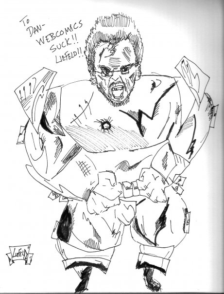
A birthday present from Chris. Thanks, buddy.
What this tells me is that I know the symbols of comic art––a wider swath, perhaps, than Liefeld, but certainly not more successful at using them than he––and using them as tools is tiring. It’s boring and expected and, most importantly, not fun. The drawing above is not a good drawing, but it is evocative and accurate for what I was trying to evoke, which is the comfort (and joy) I pull from it. The pouches, the misaligned knife, the strange jumping pose, the swollen biceps. It’s kind of like putting together pieces of a puzzle, which is an apt description of any creative act; the trick comes when you want to create the pieces. I know for my own satisfaction that I need to push past drawing symbols and rest in the stress and anxiety and payoff that comes with making sure that every eye, face, hand, and leg I draw are more than just appropriate, but right.
Discussion ¬