


Not that comics otherwise fly effortlessly from my fingertips in an inspired fugue, but one aspect of comicking that I still find particularly difficult and taxing is making sound effects. Early on, I talked about incorporating sound effects into the art itself, but I spread those attempts out from each other and, to that end, only usually for comedic effect.
In my head there exists a strange––and probably illogical––taxonomy and hierarchy of sound effects that have specific rules for use. I use the hand-drawn effects for small sounds usually caused by a character in panel interacting with a nearby object.
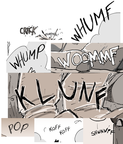
Collection of hand-drawn sound effects from Chapter 1. Most sounds with the letter “F”, apparently. There may be something wrong with my hearing.
Larger, impactful sounds require something more bold and, let’s be honest, legible than I have the patience to do by hand. There exist fonts created solely for the purpose of being used as sound effects, but I don’t feel comfortable paying what could be a sizeable sum of money for a font I may only use a few times in the comic. So, what I tend to do is pull from any standard font and “rasterize” it. What that does is that it turns the font from being a piece of text into a piece of malleable art. The danger to doing this rests in the fact that you can’t edit the text after rasterizing it. Basically, the rasterization process changes a piece of text from acting something like a .doc (in other words, text that you can edit, change, manipulate) and makes it something like a .jpg (a piece of art you can erase, draw over, etc.). Once the program (Photoshop, in my case) considers the text and image, I can add elements onto the text (or take elements away) so that it looks like something I can use to effectively convey the sound on the page.
In the case of the off-panel gunfire on this page, I used the most baseline font that everyone knows: Impact.
I typed out “KRAK” in Impact, then, to give it a character that more faithfully matches the look and tone of the comic, I traced by hand (albeit in Photoshop) the text, adding intentional elements (serifs, wavers, and wobbles) to make it more unique looking. I then hid the original Impact text and, for all intents and purposes, discarded it as I never used the typed-out text again. I copied that outline out a few times before filling in the original with black. With the outline copies, I turned them white and rotated and warped each one to create a cacophonous look to the original sound effect.
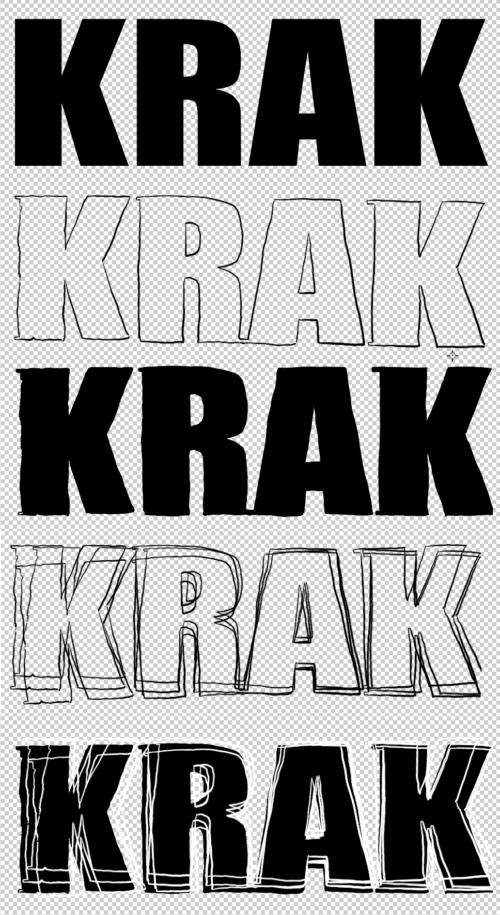
The process to produce this page’s sound effect.
Compiled together, it definitely makes it hard to miss. Whether it accurately captures the sound I wanted readers to “hear” is debatable. Like anything, I could have tweaked it a bit more, but, like with the art, at some point you have to say “done.”
Discussion ¬