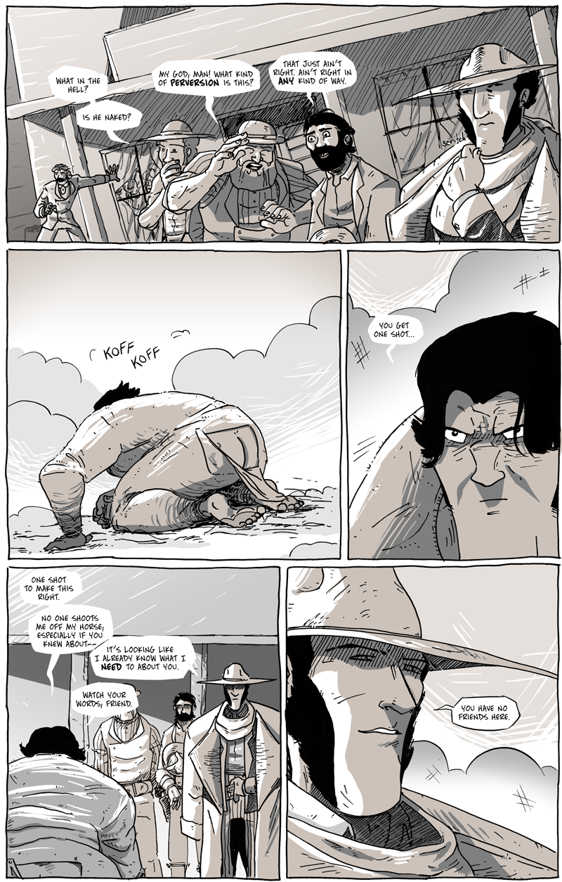
One Shot
When developing the comic, I wanted everything to be different from what I’ve done before and, if possible, to really challenge the status quo of normal comic proceedings.
That even extends to the lettering. I landed on the outline-less dialogue balloon pretty early on and was aware that it would be a difficult trend to maintain considering there would undoubtedly be a lot of white or lightly-colored backgrounds in which the balloon would just disappear.
However, even though there are some panels where, let’s say, a third of the balloon has blended into the background, at least the bottom and the tail are visible, which, since no one complained about it in the previews I sent out, seemed to rely on the old trick of forcing our brains to complete the circle. As long as it’s clear who is saying what dialogue, then I’m good with it. What’s nice about the outline-less choice is that I can actually use the standard balloon outlines for added emphasis if I wanted to, now. So, it’s nice to have that option in the bag for future use. However, mostly it’ll be used just to keep the balloon from fading into the art.
I letter digitally, but I try to keep the “hand-drawn” aesthetic even when I’m working in Photoshop. Like most serious comickers, I do my font shopping at Blambot, a site founded by an industry letterer and got the smart idea to start selling fonts to artists. What’s brilliant about Blambot is that they have yearly sales, where (depending on the year) you can buy pretty much any font at a price determined by that year. What I mean is that during this sale in 2011, all fonts cost $20.11 each. This even applied to fonts that are normally cheaper than that (I believe), but it always sucks me in and it’s always fun, at least, to look through all their offerings.
For Long John, I wanted something with a very hand-written feel but also was clean and still looked like it belonged in a dialogue balloon (I believe I’ve already expressed my umbrage with people who use fancy fonts for dialogue––SHAME ON YOU). For Eben07, I used the fairly standard Digital Strip font that is basically a standard free font you can find almost anywhere. It’s a good looking font, but it’s a bit too formal for something like Long John. I ended up finding Blambot’s Fold and Staple font and have been incredibly happy with it. At first glance, it looks like a fairly standard dialogue font, but it does have quite a bit of ruggedness on the edges that make it, dare I say, fun to look at because it has a bit of quirk to it.


Discussion ¬