


The Early Bird
As mentioned a few times before, these first three pages were actually the last to be drawn. I had been putting off a big establishing shot of the town of Bridgeport (spoilers, I guess), because big shots of bustling towns are difficult to draw.
Also, because they can be so technical––working out the math of perspective and architecture, etc.––these drawings can be boring. It’s not enough to draw a city, it’s important to draw it in an interesting way, a way that is actually fun to look at.
This idea made this concept doubly difficult: I had to draw a difficult thing and it had to be interesting to look at. To that end, an effective establishing shot is one that is dynamic, that really shows off the scale and depth of a scene.
For inspiration, I turned to the people who I think are the best in the business when it comes to these types of images, people who imbue their worlds with a strong sense of personality and life while still showing off their technical prowess. But the drawing isn’t about the technicality, it’s about the tone; it’s about the story that it’s setting up. To me, the people who do this best are Greg Capullo and Becky Cloonan. I specifically turned to Capullo because he has drawn a lot of stories that take place in cities––having spent about seven years drawing the Image Comics title, Spawn, and another four years drawing Batman.
One of the things he’s really good at––aside from everything––is playing with depth. He ingeniously places silhouettes in the foreground which really add to the cinematic quality of the scene and makes it more believable than an unimpeded view of an entire city. It has the added benefit of covering up some of the drawing. His skill is unimpeachable––he doesn’t hide things because he cannot draw them, he litters the foreground, middle ground, and background with all kinds of things because that’s how things are––stuff is everywhere. It’s a technique I’ve really wanted to incorporate more into my work. While not a cityscape, the first panel in the image below really shows what I’m talking about, a page from his indie series, We Have Demons:
I practiced this a lot in Chapter 4 to varying degrees of success, but I learned so much from the attempts. It’s not quite a reflexive tool I always know to use, but it’s something I always come around to when designing pages and I know I’ll only get better the more I do it. And even though it’s only lightly utilized on this page, I do feel that sense of depth and scale comes through more than if I hadn’t considered it at all.
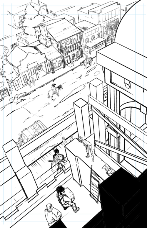
The original digital “pencils” for page 2, drawn on the iPad Pro using the app, Procreate.
Discussion ¬