
\" playing over it.")

Words Apart
Lettering is hard.
It’s not particularly difficult to do, technically, but the design sense behind it is deep and complicated.
When I had started Long John, I had six years of comicking under my belt, having co-written, drawn, lettered, and colored my previous comic. Of those jobs, I would admit that lettering was a skill I worked on least because I found a system that got the job done well enough. “I just need it to be clear,” I told myself. “Let other people do new and interesting things with word balloons.”
I developed the ballooning style for Long John early on and the rules were pretty straight-forward: rectangular balloon shape, hand-drawn asymmetrical design with soft corners, angular tails, and no black border unless needed for clarity. That was all I needed, I thought, and it worked pretty well. I put in more thought into lettering than I had previously––choosing the font for the comic ended up being a difficult and fun bit of research––and I basically thought I had figured it out.
And then this scene happened.
I had to suddenly clearly present a conversation between three people––a Poverty Flat ruffian, Larry the saloon owner, and a victim named Geoff––all of whom are unseen. Originally, I tried to make it clear by having distinct voices of each character, but that works best for characters the readers already know, not one character they met for two pages and two other characters they’ve never seen before.
I briefly––briefly––considered using dedicated fonts for each character, but that’s a technique I personally dislike in comics (sorry, Sandman). Plus, how did that sort out once the scene ended and the characters came indoors (spoiler alert)?
The idea I toyed with the most was giving each character a unique word balloon border with one being absent, the other being more jagged and the third being…something else. But balloon borders do a lot to communicate tone and I didn’t want it to look like one person was only yelling and another was only whispering or something.
So, I committed to the idea of giving each character a completely distinct balloon––the Poverty Flat ruffian gets a “normal” balloon with a white field and a black border, Larry’s is the same but with a beige field, and Geoff gets the traditional Long John-style with a white field and no border.
But this does run into the same question that was asked when considering the different fonts: what happens when they step inside the saloon? I wasn’t going to keep the differences going, so I figured I’d overlap with the final panel of this page instead of instantly reverting back to normal balloons.
I’m still not sure if it’s the best choice, but it’s one that works and doesn’t disrupt the art or composition of the page.
Either way, it made me a better letterer (though I’m leaving out the other struggle of deciding where to place balloons on the page) and I’m less skittish to try new things now because of it. I do want to point to two resources that were invaluable to me during this panicked period (I re-lettered this entire scene, from scratch, at least four times).
The first was the compiled tips of professional letterer, Nate Piekos. His tutorials are concise, clear, and whose approach to explaining the fundamentals really answered all of my questions and inspired me to try new things. Second was a book called Comic Book Lettering The “Comicraft” Way by Richard Starkings and John ‘JG’ Roshell. Starkings’ studio, Comicraft, were the pioneers of digital lettering back in the 1990s, and with this book he literally wrote the book on modern lettering. It’s cheap and a good overview of lettering from start to (digital) finish. Comicraft’s website also hosts a wonderful online resource of lettering knowledge with a spinoff site called Balloon Tales that I heartily recommend.
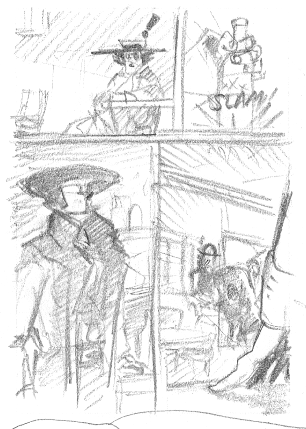
The thumbnail layouts for this page.
Discussion ¬