


Other People’s Problems
“Double-page spreads” or “two-page spreads” are a common trope of comic book design usually used to emphasize action with a large set-piece drawn over two full pages. That is, at least, the most common use in superhero comics, meant to strike a poster-worthy pose and emphasize a moment and maximize how impressive that moment is.
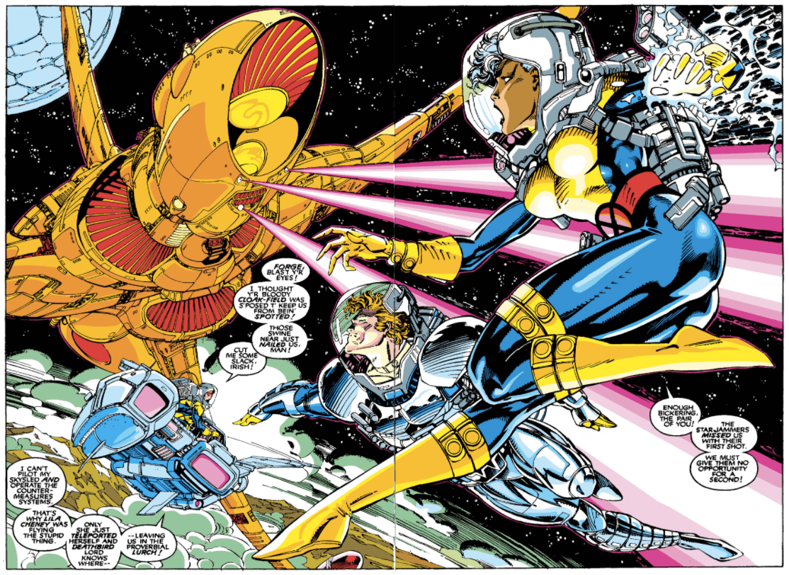
Two-page spread from Uncanny X-Men #277 by Chris Claremont (writer), Jim Lee (pencils), Scott Williams (inks), Joe Rosas (colors), and Tom Orzechowski (letters). Source: Marvel Comics
I may have spoken previously to how part of the goal of Long John is to, at least, partially subvert the tropes of westerns––going so far as being bold enough to describe the comic not as a western, but as a character study that happens to take place in 1881. I also enjoy attempts at subverting as many traditional comic tropes as possible. I don’t mean subversion simply for the sake of subversion, but to emphasize something whose emphasis serves the story. Two-page spreads in superhero comics are the highest of melodrama, in some cases they are the example of style over substance. So, knowing that the reader likely knows that, the two times I’ve used the technique in Long John have been experiments in emphasis.
The first attempt was in Chapter 3, where a big question of the comic was answered––what happened the night before page 1 of chapter 1? It was partially conceived as a way to disguise a major dump of information but also to highlight the past is the past without going into a full replay of the event. What we glimpse are memories, their subjective nature enhanced by the unorthodox shading of their illustrations, distinguishing them as different from the rest of the comic happening in the “present.”
Such is the case with this page which, in the book, will be a two-page spread. In most other comics, it’d be the scene where the dialogue is happening that the spread would highlight. However, this is Long John’s book, and we need to highlight his indifference. So, as a nod to the irony, I thought it would be funny to have a two-page spread of a dude just sitting and drinking at a bar while high drama happens outside, out of view.
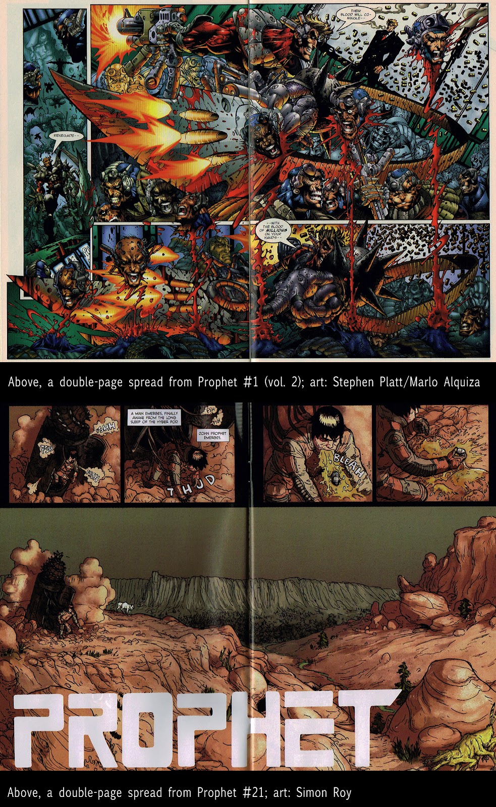
A look at the evolution of the two-page spread within the same title. At the top, a two-page spread from Prophet, vol. 2, issue #1 (1995) (pencils by Stephen Platt); below, a two-page spread from Prophet issue #21 (2012) (line art by Simon Roy).
I’m not going to pretend I’m original with this approach to the trope. Again, for me, it comes down to seeing how the 2012 reboot of Image Comics’ Prophet series by Brandon Graham and Simon Roy that showed me the opportunities available when it comes to playing within this medium. In their first issue––ironically issue #21––the first major two-page spread is mostly a landscape that showcases a desolate, alien (or is it?!) planet that our hero awakens upon after millennia of being in stasis. While dramatic, it’s certainly a restrained piece that throws expectations to the wind.
I don’t think I’ll make a habit of using two-page spreads, but when I do, it will always be in the service of that dual purpose: highlighting the melodrama happening away from the main melodrama.
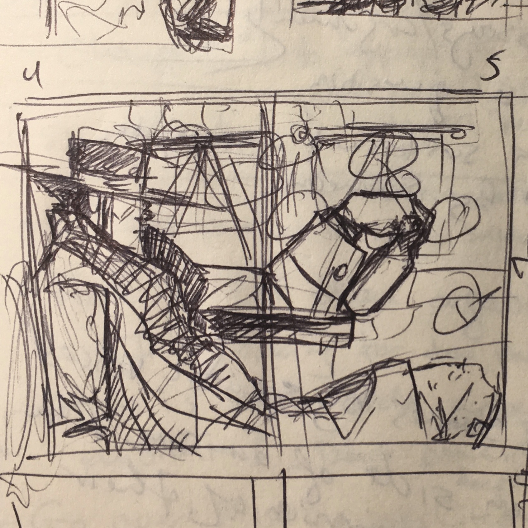
The original layout for this page, drawn in ballpoint pen in my journal.
Discussion ¬