• Newest Comic
  • About
    • Synopsis
    • Characters
    • Author
    • F.A.Q.
  • Archive
    • Comic Archive
    • Blog Archive
  • Links
    • Press
    • Connect
    • D. Bethel’s Work
    • Contact
    • Friends of Long John
  • Shop
    • Online Store
    • E-Books
  • YouTube

Long John

Losing Every Thing Changes Everything

The Real Geoff?

Dec01
by DBethel on 1 December 2023
Frank “Shorty” Harris – source: National Park Service

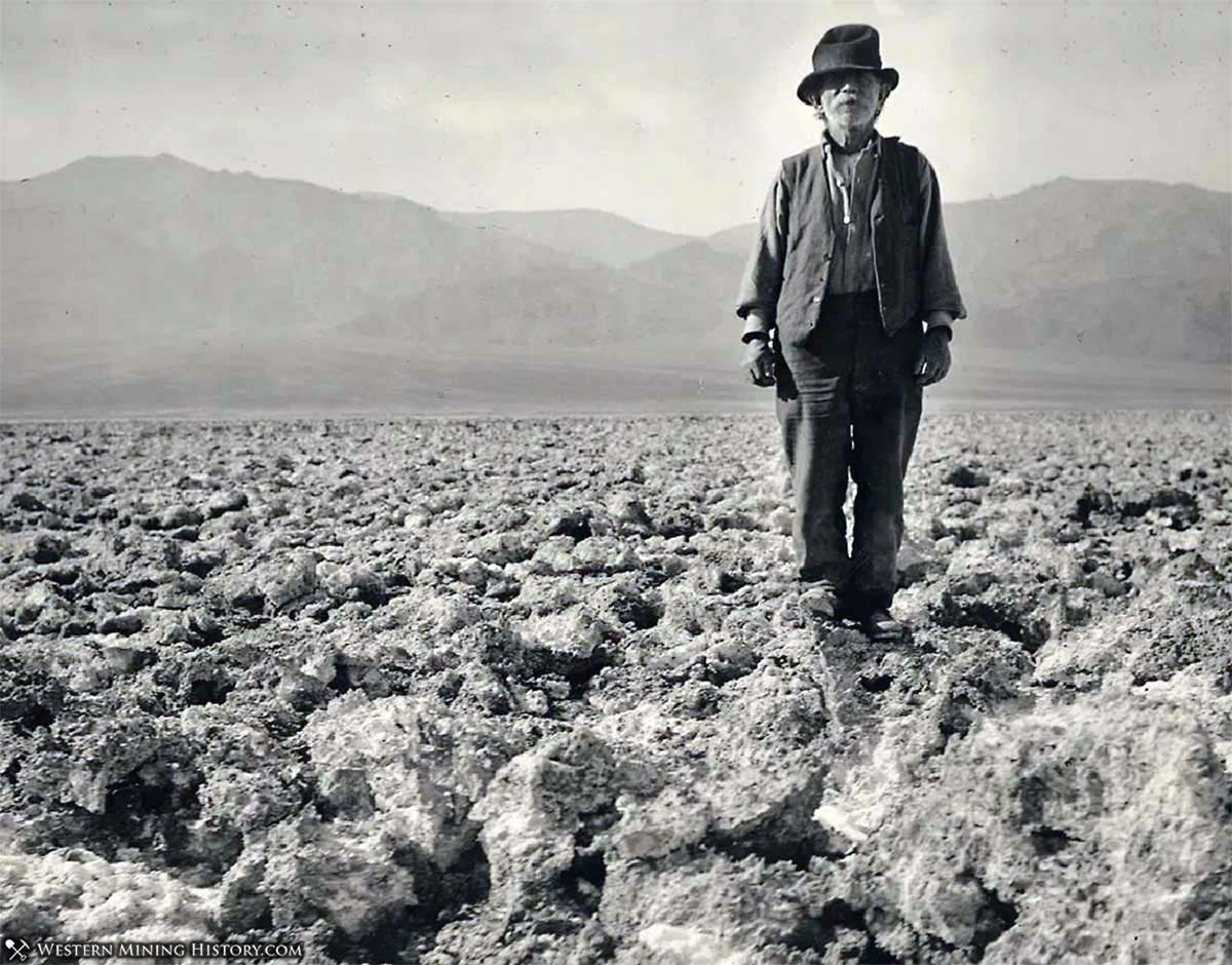
My wife came across a mind-blowing find the other day. She sent me the above image with the simple caption, “This guy reminds me of your Geoff character.” A single look had me astonished…for a few reasons.

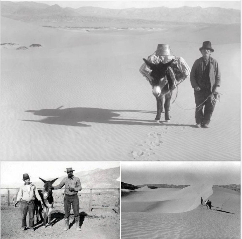
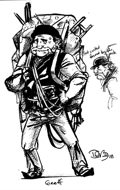
First, yes, this dude––Frank “Shorty” Harris––looks a lot like the lovable wandering merchant from the comic. Much less to see him pictured standing with a loaded up mule in a similar manner the overstuffed pack that Geoff carries in the comic.

Second, I’ve been vocal about how Geoff’s design was completely influenced by my wife’s late father, who was the definition of inimitable. I was, apparently, wrong.

Design sketches of Geoff

Though not a salesman, Shorty Harris was instead a very well-known and capable prospector in Nevada and California who spent most of his time in Southern California, though he came out west from New England (much like my wife’s father). He comes across as a colorful and unforgettable character, and all I want to do is learn more about him.

While the visual similarities are still shocking, it’s nice to know that these fiercely independent folks that quietly perforate historical records are more than just the eccentrics that movies and single paragraphs in history books paint them to be––they are archetypes, important and necessary.

Shorty Harris in Death Valley – source: WesternMiningHistory.com
 Comment 

Sketch Fridays #96 – Beast

Sep29
by DBethel on 29 September 2023
Sketch Friday #96 – X-Men’s Beast (Hank McCoy) click for larger version.

“Style” is an interesting word because it can be equally explanatory and a crutch. At its heart, I define an artist’s “style” as the immediately recognizable qualities of that artist––the intrinsic artistic fingerprint that is on all of their work. A Bruce Timm drawing always looks like a Bruce Timm drawing; a Mike Mignola drawing always looks like a Mike Mignola drawing, a Larry Stroman drawing will always look like a Larry Stroman drawing, and so on. This quality shines through even through experimentation with subject, medium, and even, ahem, style.

However, some artists insist on certain aspects of their work being their style when it’s clearly a lack of practice, ability, or knowledge. I think that parses the difference between the two types of artists––an actual artistic style is one that is recognized by others rather than self-declared.

The above drawing of the character “Beast” (known by his friends as Dr. Hank McCoy) from the X-Men was an attempt to play with style. While it ended up being an occasion to dabble in (digital) watercolors, originally I wanted to try my hand at a heavily abstracted drawing, one that disregarded accurate anatomy for design and shape. I like the final drawing, but was a bit displeased that I failed the experiment and, by my estimation, just made another “D. Bethel drawing.” And that’s how I ended up with this dilemma; while I should be reveling in the creation of a delightful new drawing, I instead force myself to wonder if I’m just a hack.

That being said, I do like the very sketchy line of the figure without much attention to traditional rendering or artistic line thickness. It’s a bit more raw than I normally do (though the lines in Long John are often quite sketchy and raw), leaving in legitimate mistakes and errors while still capturing the fullness of form of the character. Despite having a miniature existential crisis, it is a drawing I actually learned a lot from.

 Comment 

Sketch Fridays #95 – Batman Day 2023

Sep22
by DBethel on 22 September 2023
Sketch Fridays #95 – Batman Day 2023

When doing fan art, especially, I’ve been entranced by the idea of playing with negative space. I’ve posted a few attempts in the past, and while I’ve been happy with all of them, I still don’t feel like I’ve nailed the idea. Perhaps stirred by the artistic stylings of Mike Mignola, Chris Samnee, Becky Cloonan, and James Harren, I see in their art expressive lines and composition that is lacking in my finished pieces. It’s funny because I don’t feel this is the case with my comic pages, and I get frustrated with the apparent disconnection between the vivaciousness I see in my comics versus the “art” I make on the side. This is probably why I don’t do a lot of prints and stuff like that.

All that being said, I did my best to get through this idea quickly with the hope that I wouldn’t second-guess all the spontaneity out of it by the time I called it “done.” And, aside from some sloppy stars in the background, I think it turned out pretty well capturing the essence of what I was going for: a simple, graphic composition that is fun to look at.

 Comment 
  • Page 15 of 114
  • « First
  • «
  • 13
  • 14
  • 15
  • 16
  • 17
  • »
  • Last »
  • Instagram
  • Facebook
  • YouTube
Privacy & Cookies: This site uses cookies. By continuing to use this website, you agree to their use.

To find out more, including how to control cookies, see here: Cookie Policy
  • Newest Comic
  • About
  • Archive
  • Links
  • Shop
  • YouTube

©2014-2026 D. Bethel | Powered by WordPress with ComicPress | Subscribe: RSS | Back to Top ↑