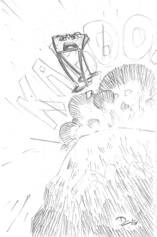
• Newest Comic
  • About
    • Synopsis
    • Characters
    • Author
    • F.A.Q.
  • Archive
    • Comic Archive
    • Blog Archive
  • Links
    • Press
    • Connect
    • D. Bethel’s Work
    • Contact
    • Friends of Long John
  • Shop
    • Online Store
    • E-Books
  • YouTube

Long John

Losing Every Thing Changes Everything

Sketch Fridays #17 – Long John Preview #02

Feb12
by DBethel on 12 February 2016
Sketch Fridays #17 - Sneak Peek #02. Click to enlarge.

Sketch Fridays #17 – Long John Preview #02. Click to enlarge.

Art should be about challenge. For both the artist and the view, art should inspire thought and discourse, the liminal edge could even be defined by the question, “do I enjoy this?”

For creators, especially, I think this question pops up regularly as we become mired in work. I haven’t made it a secret that drawing is not my favorite thing to do––however, I do not see myself as a writer for other artists quite yet. The best way for me to get my illustrative ideas out is to do them myself, even if it isn’t the most fun thing to do––the challenge (as goes the cliché) is the reward.

Long John has been a battleground, in that sense. I have come across pages or ideas where I dare myself to try something new. I don’t actively seek this out––I am a lazy artist by nature––but I do notice the call to arms occurring at different times, depending on the situation. Sometimes, it happens in the planning stage, and I get (as a result) interesting layouts. Other times, it is with technique and I get surprising results.

With an upcoming page, I realized I had to draw someone disappearing into a forest. The question I confronted was, “how do I draw that?” For which, the immediate answer was, “I don’t know.”

One of the biggest––and most visible––challenges I’ve confronted in Long John is the constant tug of war between letting the linework do the work and letting the coloring do the work. I realize that I can do a lot with coloring (especially minimalistic coloring), work that can be done were I to spend more time thinking with the pen rather than with the Photoshop swatches.

This paid off in the first chapter a few times, and I see in hindsight that despite the setbacks and whatnot in chapter two that I’ve been steadily pushing myself to try new things with the ink. The biggest problem I’ve come across in this process is that, whenever I try something new, I see it on the page and think it looks like garbage, but I’m connecting it to my past work––and, most likely, my safest work.

So, I’m brought back to a figure retreating into darkness. The included drawing is even a second attempt. I drew it on a separate piece of bristol, cut it out, and taped it over the original panel on the page (which is how I address art issues, rather than relying on digital solutions). While I found I can only do so much on the page––at least the sense of depth is alluded to––I know it will look right once I add the color. My weakness can be to rely on one or the other, but it’s when I rely on both that I can actually bring something new to the comic as well as my artistic tool belt because even if I can’t always say I enjoy doing it, I do very much enjoy what it yields.

 Comment 

Sketch Fridays #16 – Wolverine

Feb05
by DBethel on 5 February 2016
Sketch Fridays #16 - Wolverine

Sketch Fridays #16 – Wolverine (Click to enlarge), complete with ’90s era feet-hiding in use.

Growing up a reader of superhero comics, I’ve noticed fans tend to relish in the practice of categorization. This is endemic to many fandoms (if not all), and a lot of this categorization is defined with the superlatives of “Best” or “Favorite,” things that will drive a young fan’s passion and, when older, looks quite silly in hindsight.

Because superhero comics are character-driven, we have the pleasure of seeing multiple artists tackle the same character filtered through individual styles. For fervent fans, this conversation usually can be as civil as a Rogerian argument or as vitriolic as a cable news analysis panel, but, through calmer eyes, I find it fascinating how artists translate the symbols of a character into something uniquely their own.

X-Men #1 cover (1 of 5) by Jim Lee and Scott Williams.

X-Men #1 cover featuring Cyclops and Wolverine (1 of 5) by Jim Lee and Scott Williams.

I’m pretty sure that upon first glance, Wolverine became my favorite character in the X-Men (though I am a staunch Cyclops apologist as well). I had a lot of anger issues when I was young (still do, but I’ve learned to manage those tendencies much better), and Wolverine crouched (and grimaced) as a kind of self-help guide to how to deal with that kind of problem. He had a short fuse, he had problems making (and keeping) friends, but he was also a hero. Despite his anger, he used it to do good, even if it made a mess in the process.

Wolverine by Arthur Adams.

Wolverine by Arthur Adams.

There are a few requirements for Wolverine, but are prioritized around the iconographic aspects of his costume and superpowers: the pointy mask, the claws, and––if unmasked––his pointy hair. Secondly, his small stature, hairy arms, and costume choice (he’s had several, though for those in the know––and as is evident by my choice of images and my own drawing––his “brown and tan” costume is my favorite) tend to be recognizable milestones that are more malleable. Though that seems like a pretty rigorous checklist, there is quite the range for exaggeration and interpretation that artists can weave through those eyelets.

Wolverine by Sam Kieth

Wolverine by Sam Kieth

My tastes are always in flux, but I often wonder what “my” Wolverine (or Batman, etc.) would be. Right now, I like the compact frame and the restrained wings of the mask. The way the movies reinterpreted how his claws worked really impressed me and I feel compliment his personality and general approach to conflicts rather well. I tend toward a practical approach to costuming, though I couldn’t resist the wings on the boots, if only to echo the mask. But, I still try to include visible seams and I don’t particularly like to see individuated muscles or ligaments through the fabric, though I pushed that limit a little bit.

Wolverine by Moebius

Wolverine by Moebius

Though I haven’t looked at a Wolverine or X-Men comic in almost ten years (aside from Old Man Logan and the first volume of Astonishing X-Men), it seems now that the interpretations of the character seem to vacillate between Wolverine as raging animal, hulking brute, or grumpy drunk. Like all characters in the X-Men, being representatives of the Other and just wanting acceptance in a world that shuns them, I prefer to approach Wolverine from a humanistic perspective––he’s a person first, clawed maniac second (and even then, I would prefer to keep the homicidal rages as a thing of myth rather than actual habit). Perhaps it’s because I find a lot of his “faults” in line with my own, what I want is to see a heroic figure that shows that even angry people––with a little work––can be normal and functional; that the anger, rather than simply being a quality that ostracizes, is as much a tool as his claws and heightened senses to be used to help rather than harm.

4 Comments

Sketch Fridays #15 – A Boy and His Blob

Jan24
by DBethel on 24 January 2016
Sketch Fridays #15: A Boy and his Blob. Click to enlarge.

Sketch Fridays #15: A Boy and his Blob. Click to enlarge.

I’m a failed animator. I gave it my best shot, but my education happened at the time when the 2D to 3D changeover was happening and I failed to adapt. More than that, I draw slowly (as you readers know), which is not a good trait for an animator to have. When it came to the animation process, I was much more geared toward the storyboarding end of things, which fed nicely into my hobby of comicking.

Even before I knew about the work that went into animation, I appreciated good animation. As with any medium, “good” doesn’t prescribe any actual information. What I mean by “good” animation is thoughtful animation. What this usually translates to is how good the “acting” comes through in the drawings. I don’t mean voice acting, but the choices the animator makes in the characters’ movements––like an actor bringing life to a character, an animator has to do the same thing for the characters being drawn. Is the character introverted or extroverted? Is the character tired? Excited? What about the character’s past comes through in how the shoulders are held? What does a character do when she’s bored in a crowded room? All of these are choices made by the animator in order to give the character life on the screen, and––in my eyes––how well the animator knows the character the more it will come through in the acting. Making cartoons is more than just syncing mouth movements and drawing walk cycles, it’s making children act like children, the elderly strain under the weight of their years, and extraterrestrials seem relatable.

Though it’s talked about usually with regard to performance nowadays, animation (in the acting sense) is a key part of video games, yet I feel it is still an overlooked aspect of the medium, overall.

Most games are made now in “3D” in that the games are made of polygons rather than drawn sprites and bitmaps with 360 degrees of movement rather than the 2D movement limited to an X-Y axis of something like Super Mario Bros. or The Legend of Zelda. Like cinematic animation, as the technology developed, trends moved away from traditional hand-drawn drawn animation (in films) and the similar sprite-based animation (in video games) to animation generated through a combination of math and artistic talent.

However, a few developers have gone back to the traditional well and show off that even though modern technology can push a lot of polygons, it can also hold a lot of art.

There were a few games when I was young that looked like cartoons. This meant, mostly, that the sprites (the equivalent of a cell of animation; it is 2D and hand drawn, even if completely digital in creation) looked like characters from cartoons. I think of games like the X-Men 1992 arcade game, the Teenage Mutant Ninja Turtles arcade game, or almost any Capcom fighting game. They were thoroughly animated with a lot of thought creating appropriate animations and expressive characters. At the time, despite their technical limitations, it felt like I was playing a cartoon––something animated on a Disney or big-budget anime level. But there was always a disconnect (I am talking about games from the early to mid-1990s) whether it be bad transitions between animations or visual slow-down because the processor was trying hard to keep up or the pixellated sprites themselves––they never looked as slick, smooth, or clean as an animated movie. More than anything, I wanted that gap to be bridged where I could actually play a game that looked as good as a Disney movie, for example.

To that end, the best thing to happen to sprite-based games is high-definition video. Starting with the last generation of consoles (admittedly, it was probably earlier for the PC market), players started seeing sprite-based games that looked less like they were made of LEGO and more like they were painted by an actual brush. Big strides forward happened in independent games like Braid and Dust: An Elysian Tail and big-publisher games like Rayman: Origins and Ducktales: Remastered.

However, it’s the last example that––in terms of animation––stands out above the rest. Ducktales: Remastered remade the classic NES Capcom game, but the studio, WayForward Technologies, added voice acting (with many original voice actors) and redrew all of the art, adding a lot of animation making it look––and, more importantly, feel––like a cartoon. Often I would load the game up and just let it sit and I’d watch the idling animation and actually see Scrooge McDuck breath, and shift his weight, and act like a character rather than just something I control. Despite that wonderful accomplishment, it was beautifully animated sprites over rendered 3D backgrounds which cheapened the overall look.

Before Ducktales, however, WayForward actually created a triumph––the goal I had been searching for since my youth––in another remake of an old NES game. Released originally for the Nintendo Wii in 2009 (and recently released to everything else), the remake of A Boy and His Blob sprints so far into what is an animation masterpiece that I welled up when I booted up the game for the first time.

6a00d83452033569e20128763313b5970c-800wi

An actual screenshot from the game.

While there are deeper analyses that could (and should) be done about WayForward’s A Boy and His Blob––about childhood and safety and imagination and friendship––what hit me the most while playing this game was how perfect it looked. This was beyond the Ducktales experience; in every aspect, the game is a perfect amalgam of theme, gameplay, visuals, and narrative. It may not be the best game in the world, but, for the first time in my gaming experience, it really showed the power of animation in the video game context.

In many cases, the animation functions to just keep things moving on-screen so that you don’t realize you’re just moving a game piece across a board. It actually distinguishes a game from a video game, in a sense. For A Boy and His Blob, the animation acts as a narrative gateway, causing the player to not only sympathize and relate to the protagonist but also to ask questions about the story and how to figure out the puzzles in these tightly constructed levels. When the jump is too high, the boy starts to spin in the air––a clue as much as a cute addition to the visuals (for example). The animation causes the player to look around and take in the world which, for this game, is unified and cohesive; a marvelous feat. More than a lot of animated features that I’ve seen over the last few years, A Boy and His Blob really awakened an awe in me, making me wonder how they did it and––more importantly––how soon until they do it again? In short, it is a video game that really awakened the inspiration in me and I couldn’t look away.

And, for no good reason, it has a button that allows the boy to hug the blob. And that makes everything perfect.

1 Comment
  • Page 93 of 111
  • « First
  • «
  • 91
  • 92
  • 93
  • 94
  • 95
  • »
  • Last »
  • Instagram
  • Facebook
  • YouTube
Privacy & Cookies: This site uses cookies. By continuing to use this website, you agree to their use.

To find out more, including how to control cookies, see here: Cookie Policy
  • Newest Comic
  • About
  • Archive
  • Links
  • Shop
  • YouTube

©2014-2025 D. Bethel | Powered by WordPress with ComicPress | Subscribe: RSS | Back to Top ↑