


Bargaining Position
I might not be good at making comics.
It has been nearly two years since the last page of Chapter 2 posted, all to pick up right where that chapter left off. In the narrative space of the comic itself, mere seconds have passed, but for me, it was a month or two; for you, almost two years. For the wait, I apologize. For the quality of the final product, however, I do not. I’m really excited to bring you Chapter 3, “Making Smoke.” More importantly, I’m really excited to bring you the best Chapter 3 of Long John that I could possibly make. And now, finally, I get to do just that…
…with a background-less splash page.
I’ve talked before about how images sometimes jump into your mind and part of the creative process is getting there. Like Long John propped up against the tufa at the beginning or Long John crying in a corner, this image was one I had in my head for awhile, though not since the beginning. Unlike the last two chapters, which are mostly inward-focused––examining closely Long John’s reactions to situations and information––Chapter 3 is about interactions. There will be a lot more talking in this chapter and a lot more physicality and the image that came to mind that could best summarize and foreshadow all of the upcoming chapter was what you now see before you. There’s a reason why this is the title page, because this page is “Making Smoke” in a single image.
I try to be as dynamic as possible with the “acting” in my comics. I always want my characters to be doing something rather than just standing there as talking heads. I try to have them holding something, moving around, or interacting with the people and things around them because that’s what we do. We fidget. We distract ourselves. We do things for emphasis.
More importantly, for comics, it needs to look like the character(s) are interacting with the world around them. Far too often I have seen artists simply draw a gun on top of a clenched fist and call it done. That’s not what a hand looks like when it’s holding a gun. I have seen a person punching another person in a comic and it just looks like two pinup drawings were patched together––no cause and effect, no logical follow-through.
My slight history in animation prepared me for this, or at least made me aware of it. Since then, even though my style has drifted away from realism, I strive to make sure my drawings feel as real as possible. I don’t always hit it perfectly––be warned: there are plenty of technically bad drawings in this upcoming chapter, like there has been in the previous two––but the intent, meaning, and emotion is always clear, and to me that’s what matters most.
To create the most powerful opening image possible, I turned to my art history interests more than anything. Fun fact: when at an academic crossroads, the choice I presented for myself in terms of possible major was either english or art history. I love art history. I remember saying out loud to myself, after acing a test on Egyptian art, “I think I might be good at this.” That sense only strengthened as I progressed through the next few courses, culminating with late Italian Renaissance and baroque periods. Mainly, I fell hard for Gian Lorenzo Bernini‘s sculpture work.
That period of art was heavily based on Catholicism, and a lot of artistic theory was codified during that time. A major lesson that one learns is the compositional strength of the triangle. Technically, it’s is the most stable and dynamic of the basic shapes and if you look at a lot of Renaissance, baroque, and, especially, neo-classical art, one can easily see how they built around the triangular shape.
Nowhere is this more clear than in Michelangelo’s pietà.
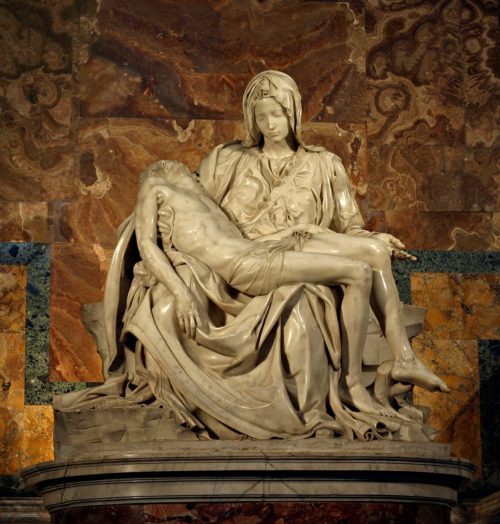
Can you see the triangle? Pietà 1498-99) – Michelangelo
This was the first image to come to mind when designing this page. I wanted to make a Long John pietà, but without the religious context. However, I did want to create an iconic emotional moment that will hit the reader hard. To that end, I wanted it to be not only structurally sound, but as expressive as possible.
That’s where my love for the baroque sculptor, Bernini, comes into play. More than any sculptor that I’ve seen, Bernini uses marble in the most expressive, emotional, and confident manner. The cloth looks like cloth, the skin not only looks like skin––it behaves like skin (not to the viewer; it doesn’t bend to the touch or anything).
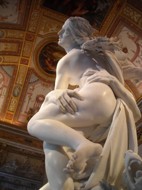
While recreating a disturbing scene from Greek mythology, Bernini’s skill with marble is undeniable. The Rape of Proserpina (1621-22)- Gian Lorenzo Bernini
Bernini did a pietà, as well, though not Catholic themed. Instead, he skewed heavily Roman and went into Roman mythology, specifically diving into The Aeneid by Virgil, which documents the Greek hero, Aeneas, and his flight from the burning Troy to found what would become Rome. It’s the Troy story specifically that Bernini captured in classic pietà form.
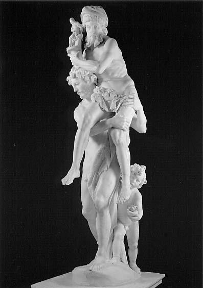
Aeneas, Anchises, and Ascanius (1618-19)- Gian Lorenzo Bernini
The constant through any pietà is interaction between figures. Specifically, the interaction is intimate, expressive, clear, and powerful. Those ideas behind the form inspired this page––which was why it was one of the last pages I drew for the chapter––and even if I missed that baseline, I know that it wholly works for not only this page or this chapter, but for Long John as a whole. It’s one of those rare instances where I can look at a drawing I did and––pushing through my own goals, ideas, and idealized versions––can say, “nailed it.”
That’s a good way to start a chapter.
Discussion (6) ¬