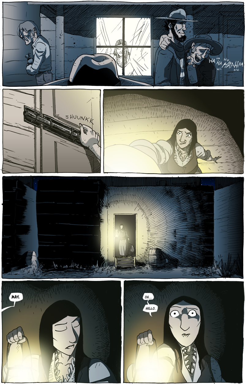
Light in the Dark
I have spoken before about playing with overlays and how––though nigh invisible––they can really enhance the mood of the scene.
When I mentioned this before, it was about distinguishing time of day. At the start of this chapter it is unequivocally night, so the dark-blue overlay was a given for me. As I was drawing the layouts for this scene, I realized that I would actually get to have some fun playing with the overlays for a few pages. To keep it clear that it’s night outside, the dark blue overlays would have to remain; however, Lady May’s shop would be illuminated. I had settled on a yellowish overlay––long before I sat down to Photoshop and actually apply it––and the main challenge (and fun) of this page was figuring out how to bounce between the blue and the yellow and, eventually have them blend together in the fourth panel (and beyond).
As stated during the last chapter, I really want to be able to use coloring as a tool of expression rather than literal representation. Since I was introducing a new character, there had to be some stability to the coloring simply to make it clear what Lady May looked like from page to page. However, the light overlays allowed me to challenge myself and––if I may be honest––play a bit.


Discussion ¬