


Self Help
An interesting thing I hadn’t considered when deciding the artistic foundations of Long John was the passage of time within the comic. Obviously, some aspects are easily controlled by pen and ink––at night, I could use heavier lines and more shadows, etc. But then there are things like sundown. How do you draw “sundown”?
I didn’t want to break the palette rules I’d established, but I knew it needed to look different than bright, overexposed shine of morning/late-morning. So, I put into play a technique I started using in the latter days of Eben07: the color overlay.
The way it works is that I color the page as I normally would; in the case of Long John, I use the same three colors that I always use.
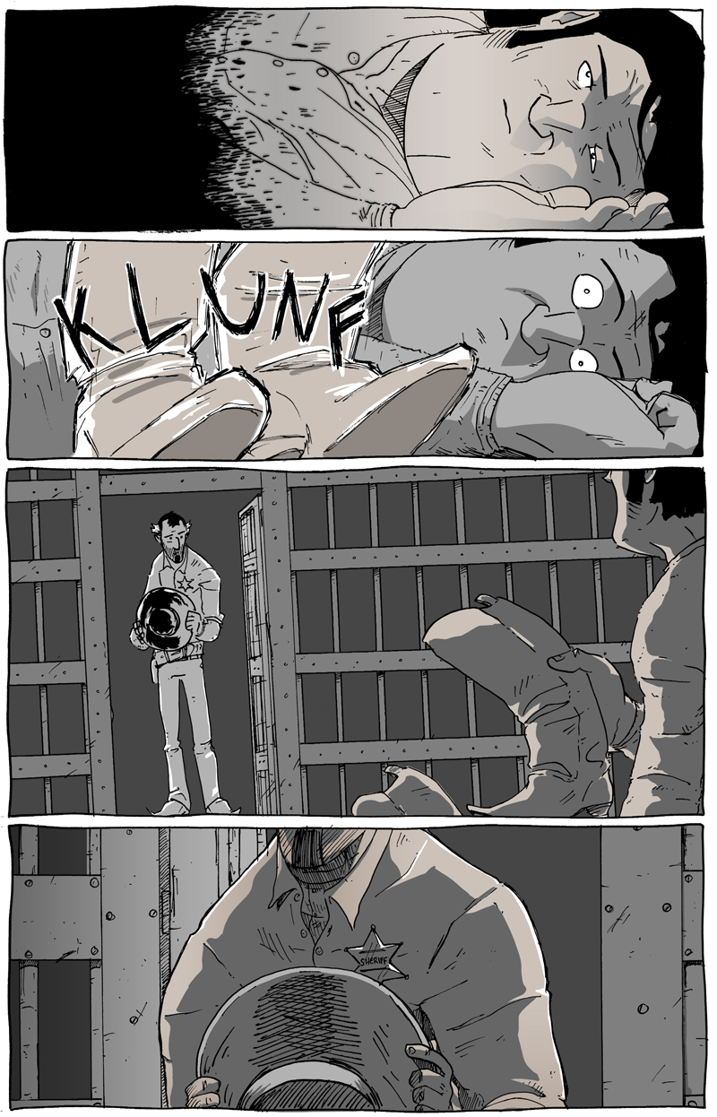
This page colored as normal.
Then I find a hue that I feel best captures the overall tone of “sundown” which, in this case, means a red-orange, burnt umber color. Covering each panel completely, I keep the overlay underneath the lines because I don’t want the lines to be affected by the overlay, just the colors (for the art nerds in the audience: though I draw the pages by hand, I have found a technique in Photoshop that quickly and easily separates the black lines from the white of the page so coloring––and manipulation of the line art itself––can be quick and easy).
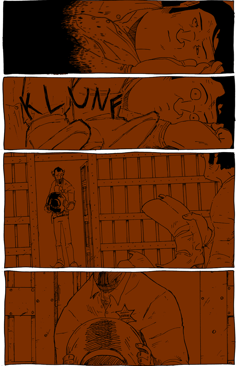
The overlay beneath the lines, but over the colors.
At this point, all that’s done is a bit of play with the opacity of the overlay until it balances on the edge between “barely noticeable” and “noticeable enough.” For this page, that means it was lowered to about 10% opacity.
When I started using this technique on Eben07, I actually put the overlay over the lines so that the black lines would also be slightly affected by the barely-there hue. For example, with outside scenes I’d overlay a light blue, which would slightly brighten not only the colors but soften the lines a bit to give it a more natural, outdoorsy feel. With Long John‘s art already being so sparse, I really wanted the lines to be the bedrock of the book, a constant which lends a malleability to everything else when it needs it to be.
––––––––––––––––––––––––
BONUS:
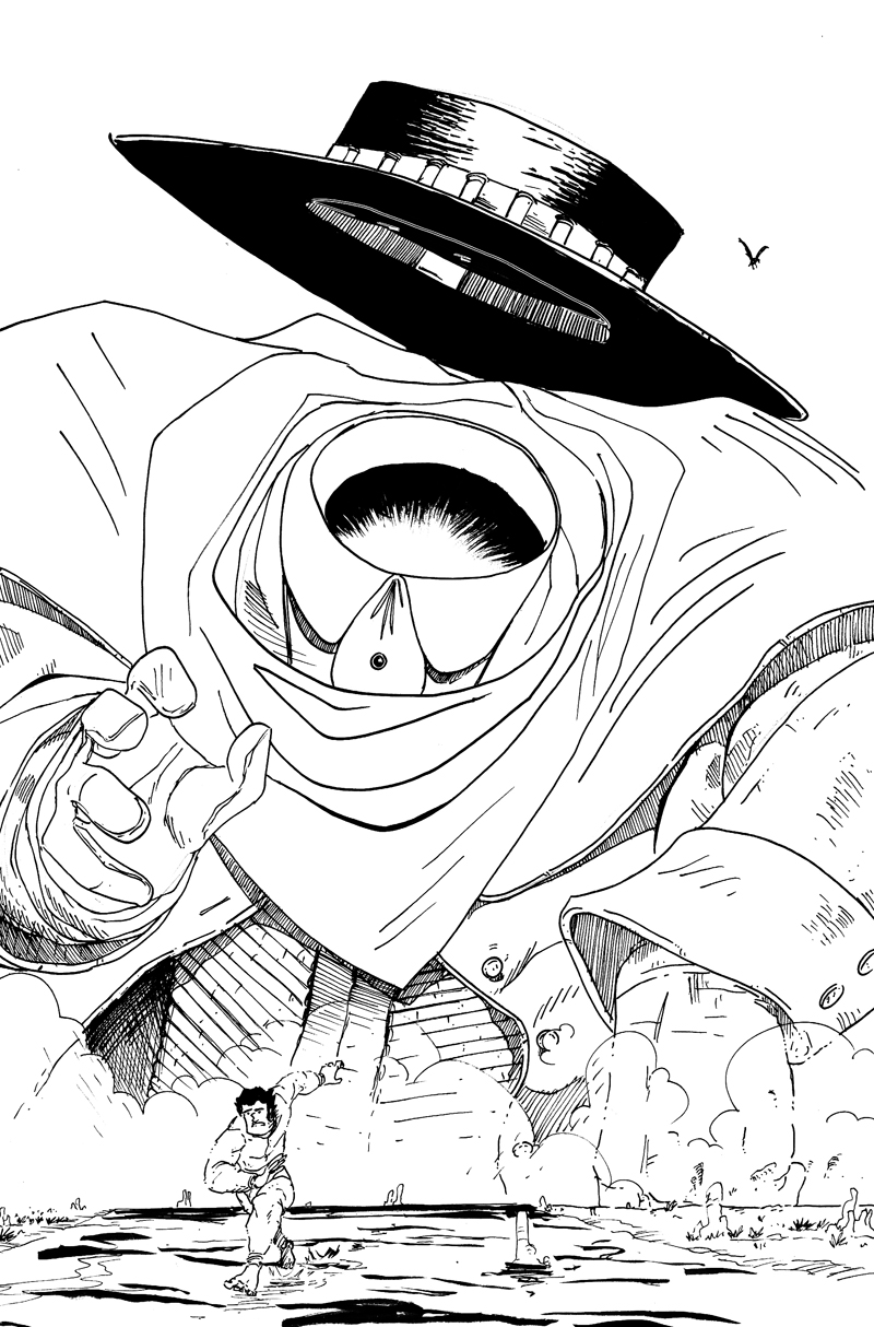
I got a lot of really nice response to the previous page, which warmed my heart quite a bit. Even though I’ve stated that Long John itself feels like a risk, this page felt like a risk within that overarching risk. A few artist friends asked to see the un-colored, unaffected line art; so, I felt it was my duty to oblige.
Discussion ¬