


No Trouble, No Service
This is a page I was eager to get to and was an image that really helped define the tone for “Bird’s Eye.” It originated as a drawing in my sketchbook toward the end of last year, but probably stretches back to seeing the works of Frank Frazetta––particularly his striking and classic fantasy painting, “Death Dealer”––when I was young. Frazetta actually draws heavily on an artist I adore and whose dynamic compositions and powerful figure work have been particularly influential on me (whether this influence comes through is not for me to decide): N.C. Wyeth.
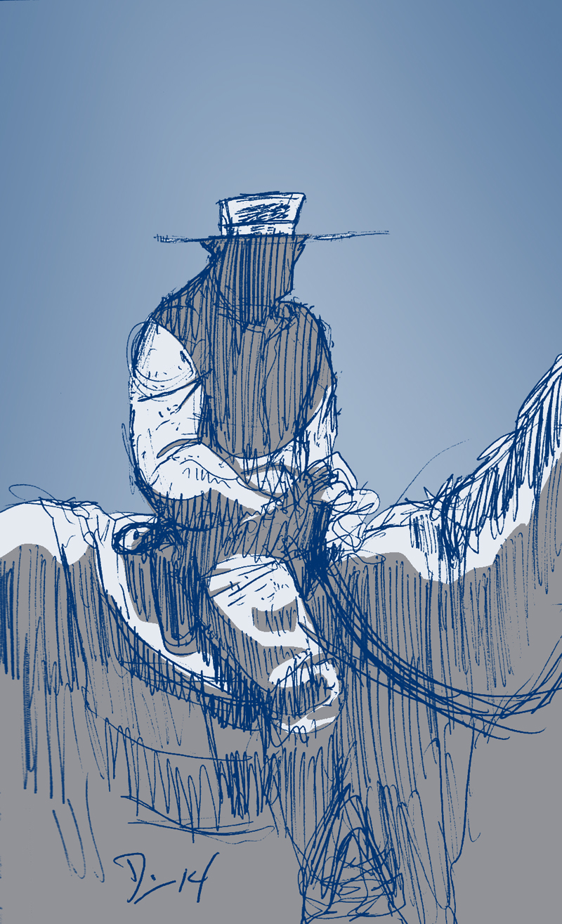
Sketch of Long John in the dark. Ballpoint & Photoshop (2014)
Unfortunately (in my eyes), N.C. Wyeth is more famous now for being the father of his famous painter son, Andrew Wyeth. But it was N.C. Wyeth, along with his mentor, Howard Pyle, and a clutch of other artists that created what’s called the Brandywine School of art. The Brandywine School wasn’t an actual school, but more of a stylistic “school” that encompassed artists that had a shared aesthetic or artistic goal. The Brandywine artists were narrative illustrators, but did so back in the day when commercial illustration was considered low art (later emboldened by the likes of Norman Rockwell). A sort of bridge between Symbolist and Impressionist art, Pyle, Wyeth (the elder), and crew set about creating what became Hollywood blockbuster visuals with literary classics and creating color plates and pen and ink drawings for inclusion within these novels, giving stories like Treasure Island, and Kidnapped (both illustrated by Wyeth) or The Merry Adventures of Robin Hood (written and illustrated by Pyle) a new, even more grandiose sense of adventure and stakes. What these artists arguably lacked in “true” artistic depth (which is bullshit), they made up for by influencing popular culture. These artists were working in the late 19th and early 20th centuries, and when film rolled around, many of the swashbuckling adventures, led by actors such as Errol Flynn and Douglas Fairbanks, were obviously influenced by the visual storytelling of the Brandywine artists.
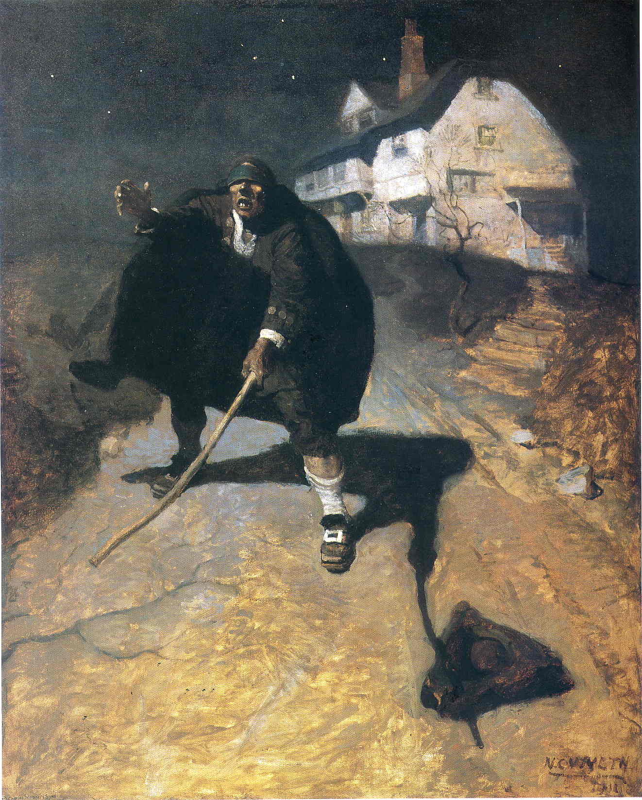
“The Old Pew” also “The Blind Pew” by N.C. Wyeth (1911).
In the mid-20th century, Frank Frazetta and his bold new take on fantasy art did basically the same thing for a new era, influencing how modern society views fantasy in characters like Conan the Cimmerian (the John Milius movie was basically trying to be a living Frazetta painting, especially in the poster art not painted by Frazetta), animated shows like He-Man and the Masters of the Universe, magazines like Métal Hurlant (and, by extension, Heavy Metal), and (of course) heavy metal album covers (“Death Dealer” was even used as the cover art by the band, Molly Hatchet, for their eponymous debut). While basically using the same narrative techniques as the Brandywine School, Frazetta’s popularity showed the inherent power of narrative illustration.
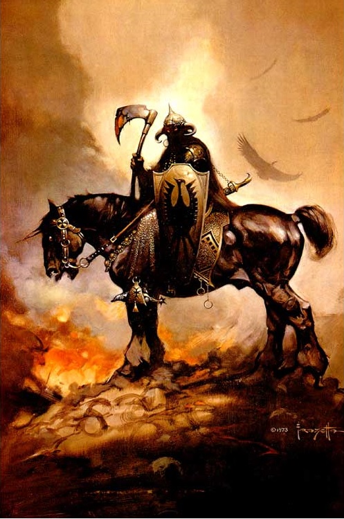
“Death Dealer” by Frank Frazetta (1973)
With something like Frazetta’s “Death Dealer” or Wyeth’s “The Old Pew,” a single image becomes as indelible as a 300-page novel, and that cannot be ignored. A comic can work along similar lines––and I think a lot of modern comics do––about getting from iconographic image to iconographic image. I definitely write this way––both comics and prose––and, to me, it’s an idea I lifted from my time as a bad animator and how they work with the idea of “key frames” (though it also relates back to when I discussed splash images being akin to kabuki theater). Key frames are important poses of an animated character that progress the scene and afford the character to satisfactorily “act” (drawn by the key––or supervising––animator). The drawings that come between these key frames are dictated by the key animator and can vary depending on the needed action (should the transition from key pose to pose be fast or slow, for example) and are called “in-between” drawings (I’m not joking). Often, the task of drawing these in-between frames are left to the unoriginally-named in-between animators because, in a sense, the humdrum work of getting to point A to point B in animation is not the most exciting or creative work. This is where the metaphor for comicking breaks down, however.
The “in-between” moments in comics, are just as necessary as the “key” poses to make all of these drawings tell a story. While a great image can be a powerful moment in a comic––and can make an amazing cover, too––it doesn’t actually tell the story. It punctuates the story, serving as a moment of summation that proves all the smaller moments between these big images are leading the reader somewhere. There is no doubt that creating an amazing image is a powerful testament to talent, but that doesn’t necessarily mean that such an artist can make comics, either. To make good comics, I hope, takes a comfortable balance between the grandiose and the mundane, because the clash between those two extremes is where things like drama, comedy, and tragedy exist.
Discussion (3) ¬
If you are ever in my neck of the woods, there are two museums you need to check out. The first is the Brandywine River Museum in Chadds Ford, PA and the second is the Delaware Art Museum in Wilmington, DE. Both have an incredible collection of Pyle and NC Wyeth original paintings (and two more generations of Wyeths as well). I was amazed the first time I saw the original works for Treasure Island and realized they were taller than me.
I can’t recall if the Philadelphia Museum of Art has any Wyeths, but I know it has several Pyles.
I have only had the pleasure of seeing one original N.C. Wyeth painting up close and personal (in the Denver Art Museum), a 1916 Western painting of his called “Gunfight.” It was amazing and, for me, rather emotional to see up close, if only because it was even more powerful to see N. C. Wyeth’s work in person and for it to be in an actual, snooty, cultured Art Museum––something I bet he never thought he would imagine would happen. I would love––LOVE––to see more of his stuff up close, and a trip out to that part of the country may just be in order at some point, if anything to see a Pyle up close, too.
As for Pyle, I remember being entranced by his “The Flying Dutchman” painting when I was young. Very dynamic, cinematic, and melodramatic work that is still so modern and relevant––more than I can say for more “legitimate” art movements of the time (if I may be so bold).