


Speak to the Bones
I never really figured myself a sucker for splash pages, but in hindsight I realize I have two planned for this eight-page story. And, as was pointed out on Panda Manga’s recent podcast review of Long John, “Sunza” alone has five (I consider only four of them to be splash pages––I don’t count the last page because it has three panels up top). So, I guess I have no real problem with them like I thought I did.
What I fear from them is the gimmick of them, the possibility of gregariousness on the level of bacchanalian self-indulgence is amplified when one decides to dedicate an entire page––valuable real estate in the world of comics––to a single image. That’s what a cover is for. That’s what a poster is for. Both of those are not necessarily storytelling devices as much as they are eye-catchers or exercises in easy audience appeal. However, after pages and pages of practice and, apparently, unconscious use, I must regard them with having some important, intrinsic narrative value.
One of the things I like about comics––but it’s also one of the most hair-pulling issues as well––is that a creator has the opportunity to not only choose the exact right image to get a story/character/scene/story moment across, but you can craft that image to be anything that’s needed. Looking over my splash pages, I realize I view them as held poses, a frozen moment in a story that takes up the entire stage and forces the reader to take it in, slowing them down because to get to the next image is no longer a matter of skipping to the next panel, but of the time it takes for the next page to load (in web form).
I have never seen a Kabuki play, but I remember reading about them as a teenager (I was an obsessive fan of medieval Japan during my teenage years––the history, not anime or manga, the actual history; it’s a topic I’ll write about someday because its influence has deep roots in everything I do). There is an important element of these productions where, at certain moments, in order to really give the audience an impression of a character or the gravity of a scene, the actor holds a position for an extended amount of time, and what was movement in a 3D space suddenly becomes a painting where lines and composition suddenly matter much more than they did a second ago, because the audience knows that this means something despite the lack of dialogue, movement, or interaction––the hallmarks of drama. That idea has stayed with me and really seems to be how I use splash pages in general––again, this was unconscious until I really looked over my work.
Going back to the review Panda Manga did of “Sunza,” I was really impressed with their level of attention and thought they put into critiquing it. It’s obvious they read it carefully and thought about it thoroughly before going to the microphone which is something for which I must commend them. Their praise was certainly nice and their criticisms were fair, especially because it was clear they weren’t simply giving knee-jerk reactions. I’ve said it on here before that one of my biggest fears going into this comic was that it was a straight-up Western, and what modern comic reader would want to read that? More importantly, how can I make a modern comic reader care about that? As I’ve outlined in different updates since the comic started in June, I made certain but specific choices in that regard, and didn’t know if they would work or not. I only knew that I liked the comic I was making, but that is definitely no indication that it was actually good. Hearing how engaged the Panda Manga reviewers were was certainly a validating moment for me as a comicker overall. As all good critiques should do, it made me want to start getting the new pages out into the world even faster. In light of that, I not only recommend people to go listen to their review of Long John, but to subscribe to the podcast itself (the podcast is actually called “Geek Life”; it’s hosted on the PandaManga.com website) on iTunes; you get reviews of that quality every episode.
Also, I wrote up a short retrospective on an artist hugely influential on both Josh and me––a Japanese painter/illustrator/designer named Yoshitaka Amano––that discusses not only how we found this very unique artist, but how his art really helped open my eyes to what illustration could be while still reinforcing the values of the basics of narrative illustration.
Josh’s Notes
This was a fun page to work on. In this page, I’ve mixed the “Jackie Vision” up a bit. I wanted it to be seen through her in her own world. You have the black rot leaving the body of the recently slain. Jackie’s horse is her mode of transport and should be formidable in her land of corruption.
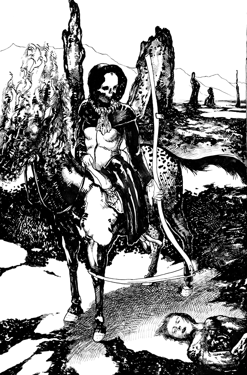
Original art by Josh Tobey.
Discussion ¬