


The Calm
Pages like this test me as an artist. I would gladly draw pages with multiple panels any day of the week than draw a splash page in most situations. It’s not necessarily that a big splash page is hard to draw; it’s more that as a single page it’s one that has to matter. Rhetorically speaking, splash pages are meant to make an impact on the reader as a single image, one that takes up an entire page in the book which is valuable real estate. To that extent, it’s in the name, isn’t it?
That’s where I get nervous about drawing splash pages––can I make a big drawing that has the impact I would like it to have? Should I focus up and make a page full of detail and rendering (which I kind of did on the title page of Chapter 1)? Should I really lean into the graphic nature and play with negative space (like I did with the title page for Chapter 3)? Do I have the chops to fill this page and make every aspect of it interesting to look at? Knowing my level of patience, I often doubt that I do.
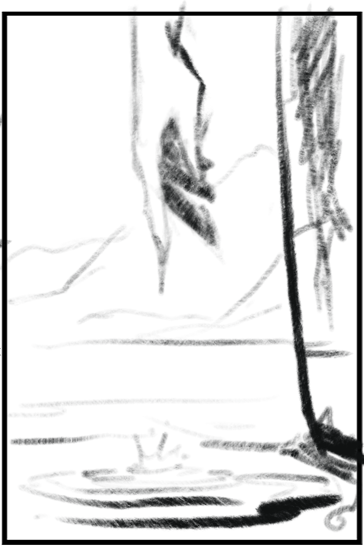
For this page, I tried to split the difference by using detail to draw your eye to the main subject––the ripples in the water––and surrounded all of that with generally simple drawing and rendering, resulting in a splash page that, if not successful as one that makes a huge impact, definitely captures the mood I was aiming for. In hindsight, it makes for an interesting companion piece to the half-splash in Chapter 3 just before violence kicks off.
The thumbnail image for this page. Click for larger version.
Discussion ¬