


A Taste of Risk
In the world of comics criticism, a persistent debate exists that argues against the use of cinematic terminology when discussing comics. The argument here is based on the idea that by pulling in the diction of other fields, we are actually limited the conversation around comics and forever pitting it against a form of art it literally can’t be (because movies are movies and comics are comics, literally two different things).
I see that argument very clearly. Especially as an ardent proponent of independent creators and the idea of a “comicker” being someone who is not “just” a writer or “just” an artist but something unique standing between the two, I completely understand this point of view.
This won’t ever change, however, if comic creators don’t stop using the language of film to describe their work. That will be impossible because of how artists draw. Most, when drawing a panel, aren’t thinking about how it will help sell the comic to a movie studio––most aren’t making decisions based on that––instead they are the camera and are trying to look into and show the reader a world that doesn’t exist. But to describe specific angles or lighting, cinematic terminology is the most accessible and easiest to learn and apply. Terms like “Dutch tilt,” “worm’s eye view,” “wide shot,” or “rim lighting” all likely existed in some form or another before film came along––either in photography or painting––but cinematography brought these terms together, gave us a lot of examples to look at, and made it relatively easy and practical to learn.
All of that being said, I’ve written before about the painful process of thumbnailing the layouts for a page. It’s messy because I’m always erasing. I’m always erasing not because I don’t know what to draw, but I’m agonizing over how to show it, and a lot of that comes down to choosing the right “shot.”
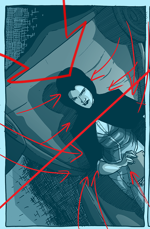
Many of the different cinematic and compositional tools I used to design this panel.
I think one of the tropes I rely on most––and, honestly, it would be hard to abandon––is the use of high and low angles when focusing on characters. There is an implied psychology behind their use––generally, high angles make a character look weak and low angle shots make a character look stronger––but I think the composition of the panel around the angle can also change the tone. For example, the first panel of this page is a high angle look at The Rook (which would normally depower her in the scene), but it’s also at a dutch tilt (meaning that the camera has titled the horizon or eye line of the image), which tends to create an unsettling feeling because it looks off-kilter. Those combined with the composition––the lines of the chair pointing directly to her face and hands––create (I hope) a feeling of disconcerted surprise, which is what Mr. Carrillo has been feeling since this conversation started.
Playing with angles––and why artists learn the terms––is also fun to challenge yourself to draw. So, strange angles are not only rhetorical tools in the belt of comickers, they are points of personal achievement, as well. Plus, it’s away to actually learn and grow while also telling a story at the same time. I’m still at odds what to do with using cinematic terminology on a critical level, but there’s no denying they help make comics good and interesting. More importantly, knowing these terms and how they work help make making comics a lot of fun (and frustrating).
Discussion ¬