


The first comic book colorist I actually remember noticing was embarrassingly late into my initial run reading comic books; however, thinking back on that work, I’m sure I pull all of my basic coloring techniques from a color artist named Ben Fernandez.
He worked for the studio, Wildstorm, in the 1990s, a studio whose work I knew very well as it was founded by my artistic icon at the time, Jim Lee, after he left Marvel Comics to co-found Image Comics. And while I mostly bought and read this studio’s work because of who was drawing it, Fernandez’s colors really stood out from the rest.
Wildstorm was founded and, indeed, lead the charge in computer-based coloring, a relatively new technique for the industry (in fact, it’s arguable that Wildstorm was bought by DC comics solely because of the reputation of its coloring department), and with that came a strong push for more realistic color rendering with its soft gradients and lens flares. These were emphasized by the glossier paper that comics––especially Image Comics––were printed on. So it really stood out when Fernandez colored a comic because he took a more separated, cartoony approach that really spoke to my developing aesthetic.
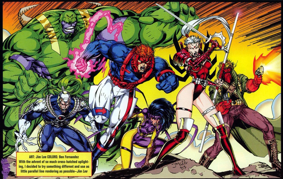
A Jim Lee drawn, Ben Fernandez-colored poster of the WildC.A.T.s. Source: DC Comics
His shadows and shading had hard edges, making them look more akin to animation than what was becoming the comic book standard. They added to the high octane melodrama of ’90s superhero comics and Fernandez’s style became almost a game to me. His work stood out that I would take notice of it while reading a comic and I’d say to myself, “Ah, this is Ben Fernandez, which would force me to turn back to the credits page for affirmation. It wasn’t easy because it was bad or simple, it was easy to spot because I liked it.
I have never been very confident with my coloring skills. My previous comic was a full-color series so I had to go with what worked to get comics out on time. I decided not to overthink my coloring and went with whatever looked good to me. Looking back, I was aping the techniques I saw in the work Fernandez did in the comics of my youth, and it’s a style that persists. I can point to things like the way the fire illuminates the fireplace in today’s page or the glow of light on the walls around the lamps in the third panel to the three distinct levels of light and shadow on The Rook’s skirt in the last panel, separated by clear, defined edges.
This was not what I was planning to write about when I sat down today, but something about looking at the geometry of my colors made me ask, “Why do I do that?” led me down a very pleasant and nostalgic path.
Discussion ¬