States of Development
Making comics is always a fight about space.
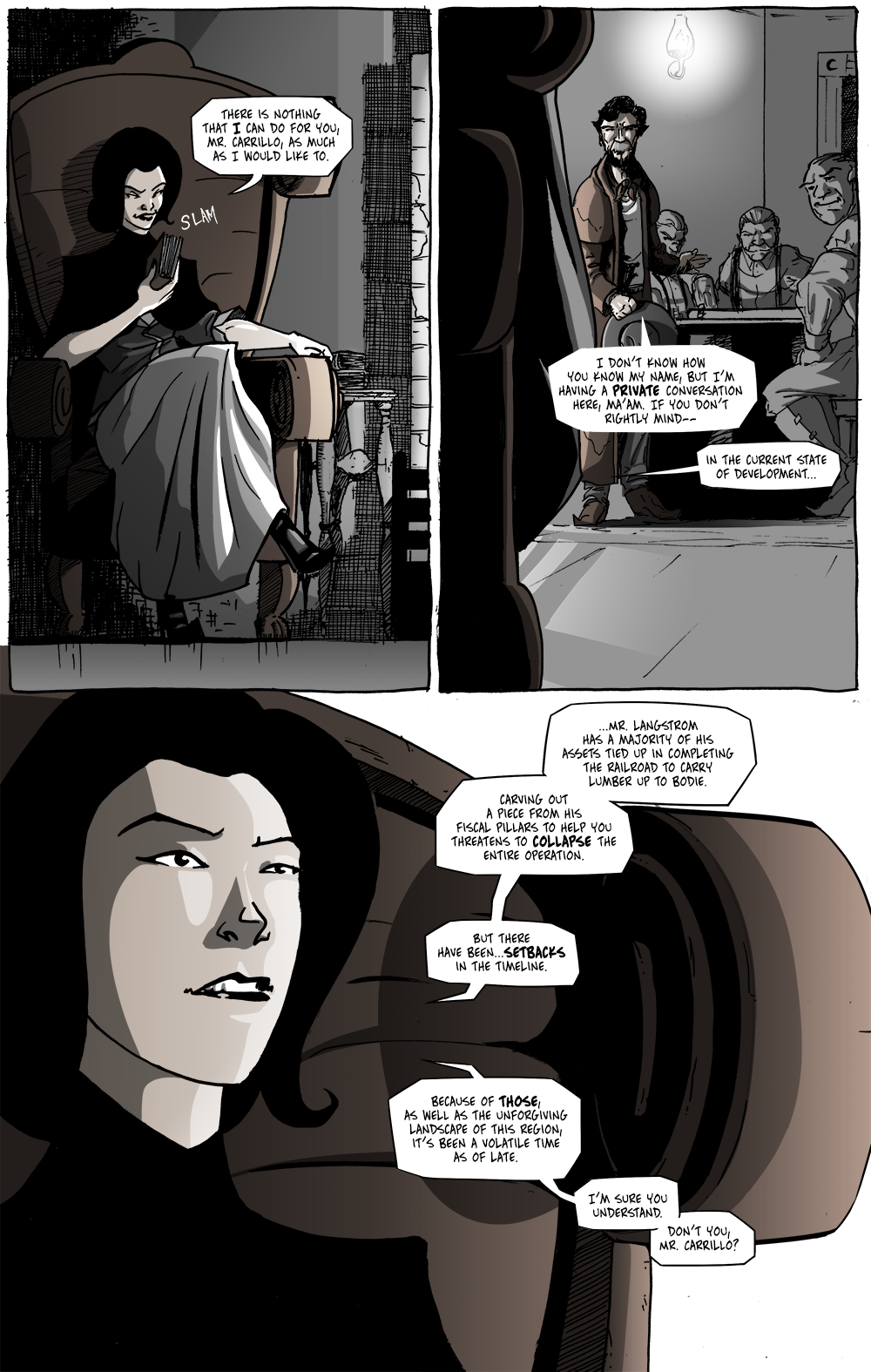
Unlike prose where a writer has the ability to stretch out descriptions for as long as they would like (though, it certainly can be too long), in comics the text and the art are scrapping over real estate on the page. Of course, most of this is mediated in the thumbnailing and scripting processes so that both parties are content by the time the page reaches the reader.
Like a lot of creative work, there often comes a point in the creation where you kind of play the scene out in your head like a movie. The problem there is the language of movies isn’t the same as sequential art (as Will Eisner called comic book storytelling), and many tools available to motion pictures simply don’t apply to still pictures.
Take, for example, dramatic pauses.
The best way to handle that in comics is to add a panel where everything is silent before having a panel with a witty retort. Sometimes, it helps to even have two silent panels. The problem, however, is that every panel you add has to fit in the floor plan of the page, so the others need to move around, get smaller, or get removed. It’s frustrating, but sometimes it’s worth it.
What comics have over motion pictures (although, technically, film could do this, too) is that it has multiple layers of visuals at its disposal to guide the eye and create an experience. Obviously, there’s the art itself, but the other layer I mean is the text.
Too often, comickers think of the dialogue as the writer’s property––it is words, after all; therefore, they are in the best position to make decisions about it. That’s not true at all.
As I often say in class, everything is rhetoric––that is, choices made to get people’s attention. So, the placement and arrangement of text on a page is as important as the art in many ways. It’s not just about “leaving room” for the dialogue, it’s about using the word balloons as part of the story-telling process in more ways than just the words themselves.
I’ve discussed how I learned a lot about lettering during this chapter and I still have a lot to learn, but it was in this scene, in particular, where I finally saw the rhetorical power of text placement and how it can speed up or slow down the reader, how a quick retort can be created without spending (as much) space. Lettering is undoubtedly an art in its own right and even more so an essential tool in the comicker’s belt. (Finding a font for this comic back when I was starting it was a drawn-out, stressful process. Who knew?!)
––––––––––––––
In a bit of fun, unexpected news, Long John was highlighted the other day on a union suit appreciation blog, “Union Suit Fans in the Limelight.”
Chris commented on the site awhile ago and brought to my attention his blogs and asked if he could feature the comic at some point. There, of course, no reason to deny that and I found his write up particularly thoughtful and interesting. Though I don’t consider myself an enthusiast of union suits (longjohns, for those confused by the term), I am happy with the knowledge that those who are can find much to appreciate in the comic. Thanks again for the feature, Chris!


Discussion ¬