The Effect and The Cause
Long John is a webcomic. I’m proud of that fact. With every description I publish, I always say it’s a webcomic rather than simply a “comic” or a “graphic novel.” Though the definition of this medium has changed drastically since I started back in 2007, the baseline of making pages to put onto a website for readers was the intent when I first started the comic and that continues to motivate.
Every page of story that appears on the website appears in the books, especially now because I make the books first before posting the pages onto the website, so what you get in the books is always what you see on the site (though the books do have some extra content not available on the website; overall, the sites have way more content, though).
Until today.
Of the many types of page layouts that have jingoistic, but descriptive, names, the only one I really have leaned on in Long John was the full-page spread or splash page. These tend to be pages that don’t have many or any panels on them and are just single images that take up the entire page. I used them a lot in Chapter 1, more sparingly in Chapter 2, and a few times in Chapter 3. I like splash pages because no strange formatting is required to make them and, when compared to a page with many panels, they can be easier to draw and have a huge impact on the reader.
One archetypal layout I have vehemently avoided is one called a “double-page spread.” This is where a page layout is contiguous over two pages laid side-by-side. I avoided these for a few reasons. First, they were de rigueur in superhero comics in the 1990s and were almost always not needed for the content they contained (they did tend to look cool, though). For me, being an indie dude, I wanted to stay away from the superficial bombast that puts off many people. Second, double-page spreads can be tricky to format because they stretch across the fold of a print book. So, the dimensions have to be specific and, often, can change from printer to printer. Also, you have to lay out the pages in a way so that no important art spans the fold and, ultimately gets pinched when printed, like the back cover of a Mad Magazine. Third, they are problematic for webcomics for reasons of site design and scrolling, but we’ll get to that.
But I broke that rule with Chapter 3. I happened upon a concept that I liked and would not be superfluous. The spread would, actually, be incredibly important to the story. So, with heavy trepidation, I got to work.
The trepidation was so heavy, in fact, that it sat blank on my desk for a week or so. The only other time I had drawn a two-page spread was early on with my previous comic, and that was completely digital, so I could move stuff around easily. So, what this means is that this Long John spread is the first time I’ve ever drawn a two-page spread.
But once I got going, it went pretty well. Most importantly, it looked great when printed.
View this post on Instagram
I threw down a lot of ink today. ::::: #makecomics #indiecomics #LongJohnComic #art
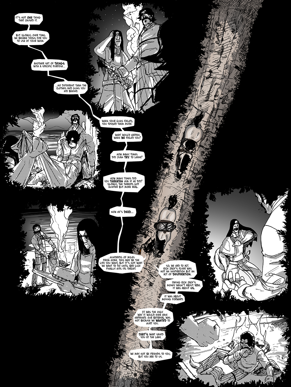
But then came the horrifying realization: Long John is a webcomic. One of the sins of webcomic layouts is making the reader scroll. Since most scrolling happens vertically, I never let that bother me––scrolling down to read the page is natural and is something readers do all the time. Scrolling horizontally, however, is unforgivable.
Much like how I drew the spread for the book, when it came to figuring out how to get this onto the website without asking the readers to do something that would break the bond of trust between creator and reader, I put it off for awhile.
The idea to reformat the pages into a vertical arrangement came to me early, I just knew it would be a lot of work. However, I generally like how it turned out, though it did shrink the type a bit, but not out of the realm of legibility. But it was a fun digital challenge while I was working on it. The process really brought to bear how vertical layouts are very different beasts from horizontal ones and how the eye treats those spaces. It wasn’t just a matter of turning everything 90-degrees, but making sure it read well caused me to move stuff around significantly from the printed version.
I guess it wasn’t necessary––there are other, less intrusive ways around this problem––but I wanted it to be good as a webcomic rather than just being a page that hosted pages from a print book. So, it was worth the effort and is, again, something you’ll only see on this website, making it another addition to the pile of unique content that the webcomic medium can provide that few others can.


Discussion ¬