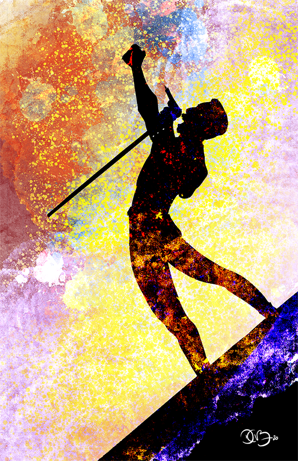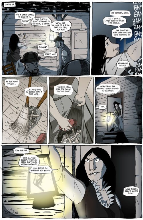
Chapter 3, Page 31 – “Living Dogs & Dead Lions“
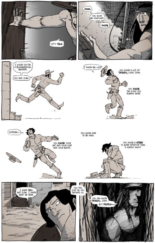
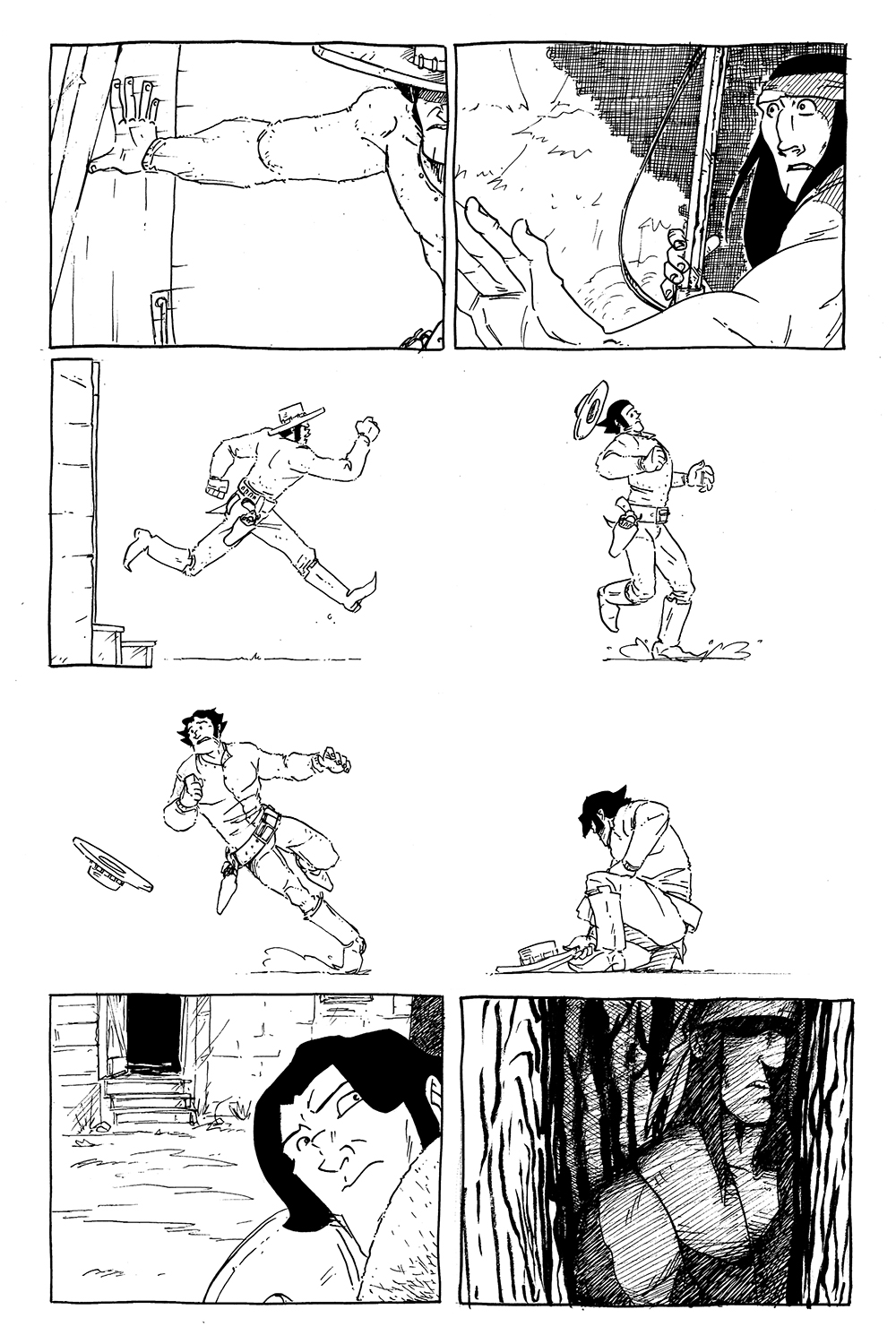
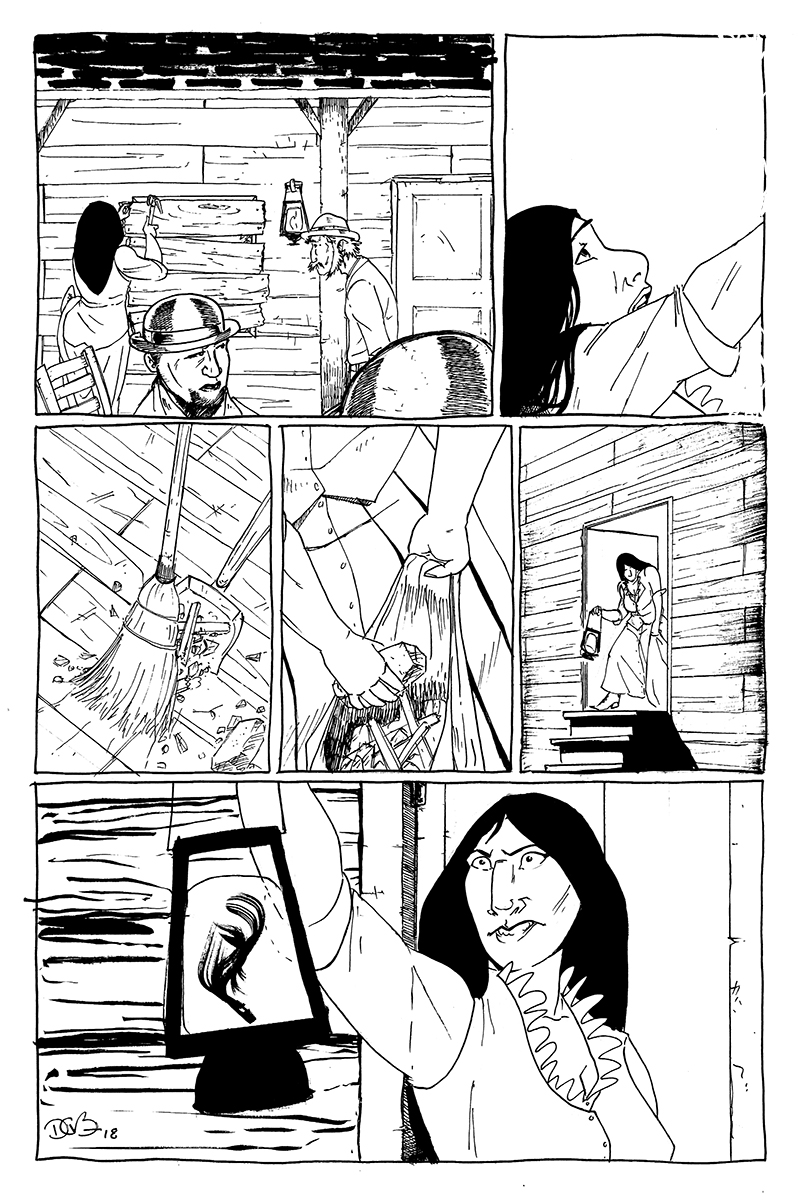
Early in the development of Chapter 1, there were a few strict visual symbols I made sure to regularly work in to the book because they represented something important to the character of Long John. At least, important to how I understood him at that time. In many shots of the first two chapters, for example, Long John is framed between two strong verticals, representing how trapped he is in his own mind and past.
Obviously, as the work went forward and became more concrete and the story more detailed and the characters more nuanced, the abstract and, ultimately, uninformed ideas floated away for a more subtle approach to theme and storytelling.
Chapters 2 and 3 are really two parts of the same story, and knowing how much time it takes to make one of these books, the end of Chapter 3 had a long runway for planning. Of course, I knew what would happen in terms of plot, but the realization that Chapter 3 would literally end where Chapter 2 began––at Lady May’s storefront––and do so with the main character in a very different place than before felt almost poetic and classic (in the sense of a chiastic or ring narrative structure found as far back as Homer’s work in The Iliad and The Odyssey) and made the two chapter arc feel much more complete and literary than before. So, of course, I couldn’t help myself to try to have the story––once it hit a thematic middle point––move in reverse order while still moving the plot forward. That’s what two English degrees gets you, I guess.
So I formatted this page to broadly mirror the last time May went out back to find Long John waiting for her in the dark. Doing that––and being the English nerd that I am––really made this part of the story feel like a cohesive unit to me and that this story I was telling had all the narrative and thematic weight I hoped it would have, at least with the ability I had at the time.
While the scenario may be similar, it’s clear a lot has changed in the interim. Long John has gone from a tired, broken, confused man to a confident, angry, man with a plan, setting up the back half of the rest of the comic. So, in a lot of ways, it’s a page that I’m really proud of because of how it culminates the story of Chapters 2 & 3, but I’m also very proud of the page itself. On a superficial level, I am please with how good the page looks on its own, which––after all of this deep thought––is a nice bonus on top of it all.